
Choosing the right typography (or fonts) for your visual content can be difficult if you’re not a seasoned designer, but it doesn’t have to be.
The good news is that all you need are a handful of helpful tips to start improving your visual content typography today!
In this post, I cover some basic principals of choosing the right fonts, pairing fonts and a handful of typography do’s and don’ts. These are things that anybody can begin implementing.
Message is First and Foremost
When choosing your fonts for visual content keep in mind the message you want to communicate. I’ve said this a thousand times in blog posts and speaking engagements:
The purpose of good design is to effectively communicate a message.
Making things look good is a worthless feat if it’s not helping you communicate your primary message.
You must have a singular objective of what you want to communicate to the viewer/reader. What is the one thing you want them to interpret?
Solidify it in your mind and let that message be the filter for everything you add to or takeaway from your visual content piece.
You might think, “what does that have to do with just picking a font?”
I’m so glad you asked.
Typography Has Personality
Just like different styles of clothing can communicate and accentuate different personality types the fonts you choose can completely change the mood of your content.
There’s even a quiz you can take to discover what typeface you are.
To help explain this concept, Sarah Hyndman does a fantastic job in her TEDx talk:
“To the child in me, fonts are like multi-sensory imagination grenades.”
In her talk she explores the parallel between how the clothes you wear make an immediate impression as does the type you choose for a graphical piece.
So the first question you need to ask when choosing a font is: what kind of impression do I want to make?
Do you want to look sophisticated or whimsical? Do you want to come off as elegant or practical? Do you want to be seen as exciting or calm, cool, and collected?
Here are some basic ideas of how each typographic classification is often perceived:
- Serif: smart, traditional, sophisticated, sturdy
- Sans Serif: casual, easy-going, personable
- Script: fancy, high-class, expensive
- Monospace: plain, technical, utilitarian
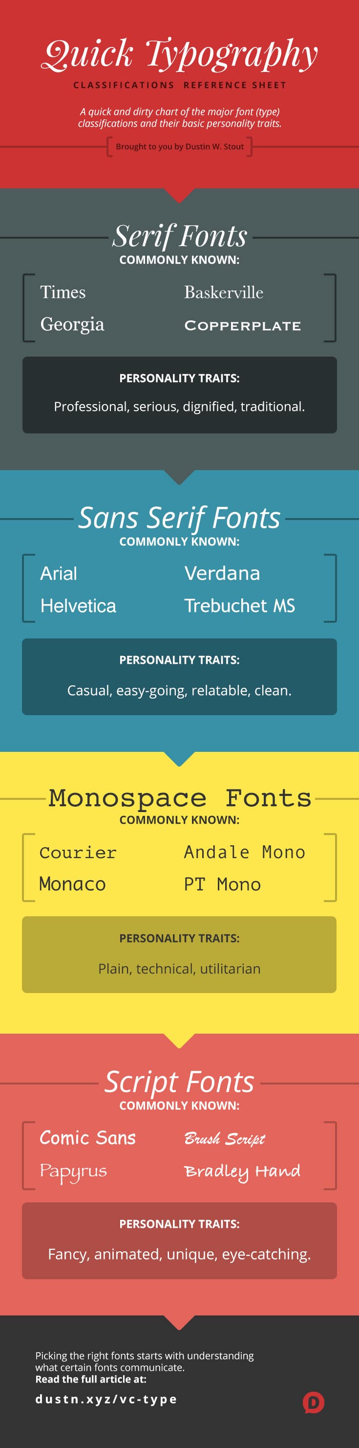
These are, of course, very generalized as there are many styles within each type classification. I highly recommend this article which dives deeper on the classifications and styles.
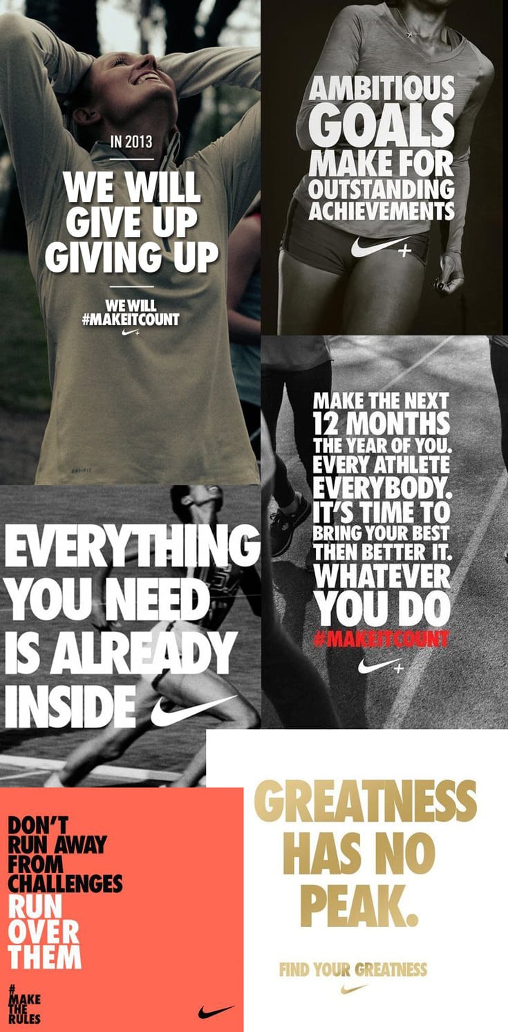
Key Takeaway: your font choice will have a personality trait (or traits) that will affect how your content is perceived.
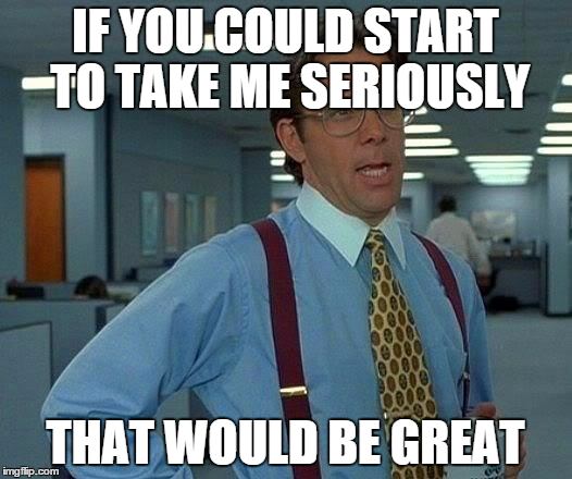
For example:
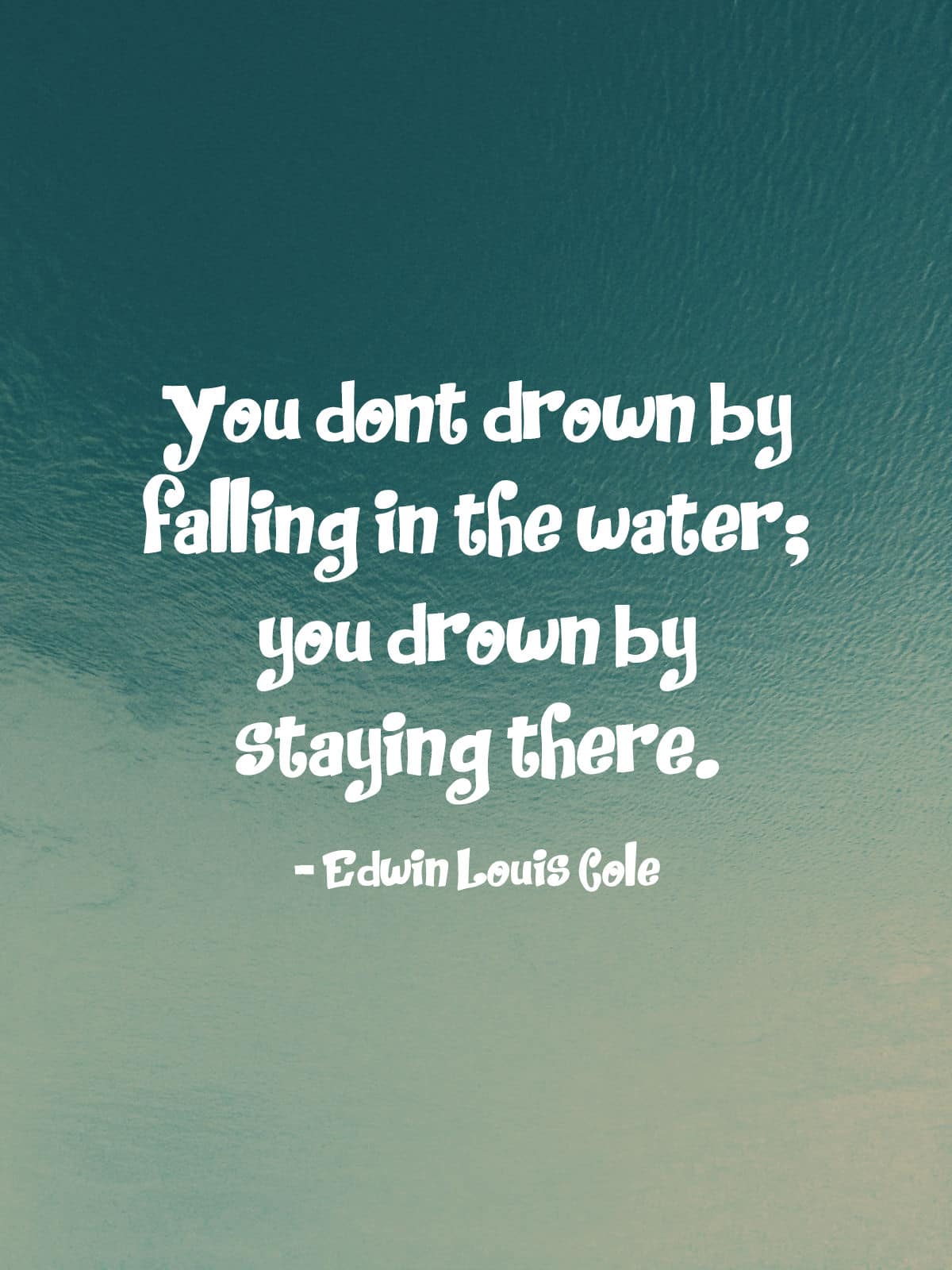
In the above image, you can see that the seriousness of the content is undermined by the comical nature of the font used.
This is not what you want.
You want your font choice to compliment your underlying message. Here’s what a better font choice looks like:
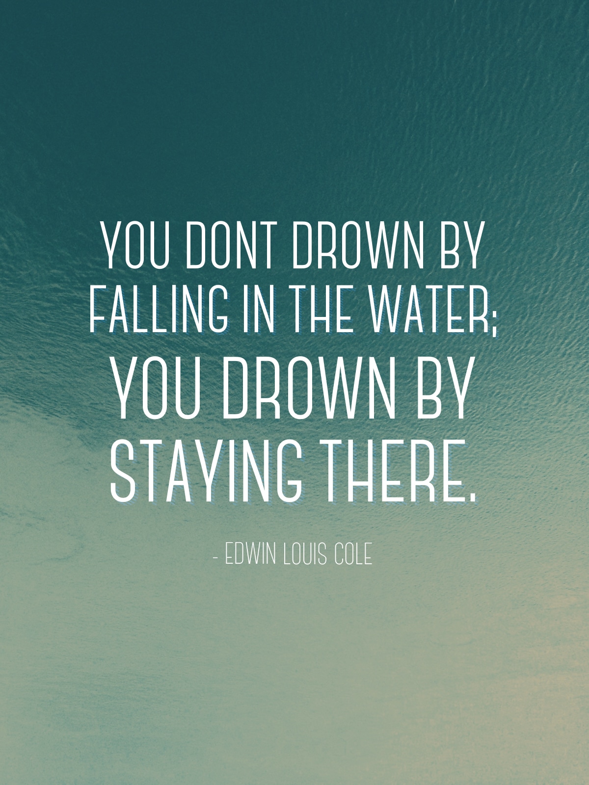
Notice how it feels a bit more connected to the message.
Being Consistent vs Being “Creative”
If you’re building a personal brand or a business brand, I highly recommend deciding on a typographic style that you stick with consistently.
Pick 1-2 fonts that you use for everything. This is something I’ve also mentioned in my article on designing a stunning reading experience on your blog.
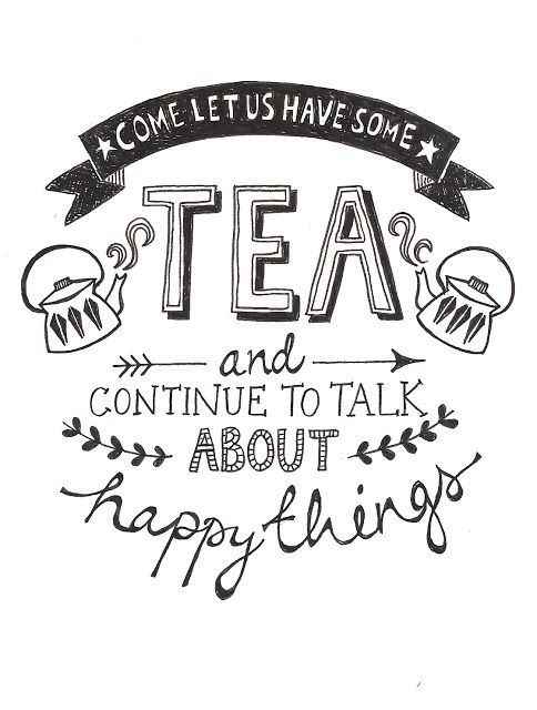
The same rules can be applied to visual content.
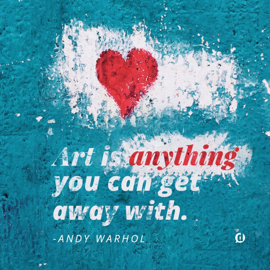
Notice how in the above image there are two fonts used. This makes it easy for the viewer to process what they’re seeing because their brain is not having to process and decode too many different fonts at once.
Not only is limiting your fonts easier on the viewer, but it’s better for branding.
You’ll notice that all big brands have a specific set of types (or fonts) that they use on everything. This not only makes for a consistent and highly professional looking impression but also makes the creation of new visuals easier because your fonts are already chosen.
Now, are there plenty of examples where many different fonts are used to create a great typographic piece? Of course!
However, these types of pieces are often created by professionals. People who have been pairing and matching fonts for a long time.
They’re also extremely time-consuming to create. So my biggest piece of advice is: leave the complicated stuff to the pros and focus on being simple and effective.
Where to Find Great Fonts
If you’re working with design apps such as Canva, Adobe Spark, PicMonkey or other web-based design apps then your font selections will be limited to the ones they make available. This is also true of mobile design apps.
However, if you’re using a desktop application such as Photoshop, Pixelmator, or Gimp then you can use fonts you’ve downloaded onto your computer.
If you have this ability, I’ve found there are a handful of sites that I use for reliable font downloads:
I use DaFont as a last resort, because it can be hit or miss with quality. Since it’s such a high-volume site, there is bound to be lots of low-quality (or even straight up broken) files throughout the site.
Between Google Fonts and Lost Type though, I rarely need to go elsewhere.
Typographic Inspiration
Sometimes it just helps to observe what other great artists are doing to help shape and inspire your own design. So, below are a list of places where I go frequently to find inspiration.
Apps like Adobe Spark and Canva also make it super easy to get inspired with their designer templates.
Typography No-nos
Now, as one last effort to give you some good, practical and actionable (or non-actionable depending on how you look at it) advice, here is a list of things you definitely do not want to do when it comes to typography:
Never use Comic Sans. Ever.
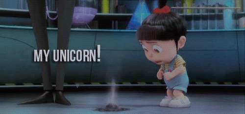
Every time you do, a Unicorn dies.
Seriously, there has been no other font in the history of fonts that will make a piece of content look more amateur.
Comic sans is one of the most reviled fonts on the internet. Unless your visual is meant for pre-schoolers, you will only be doing yourself a disservice by using it.
Just. Don’t. Use. It. Ever.
Never use Papyrus. Ever.
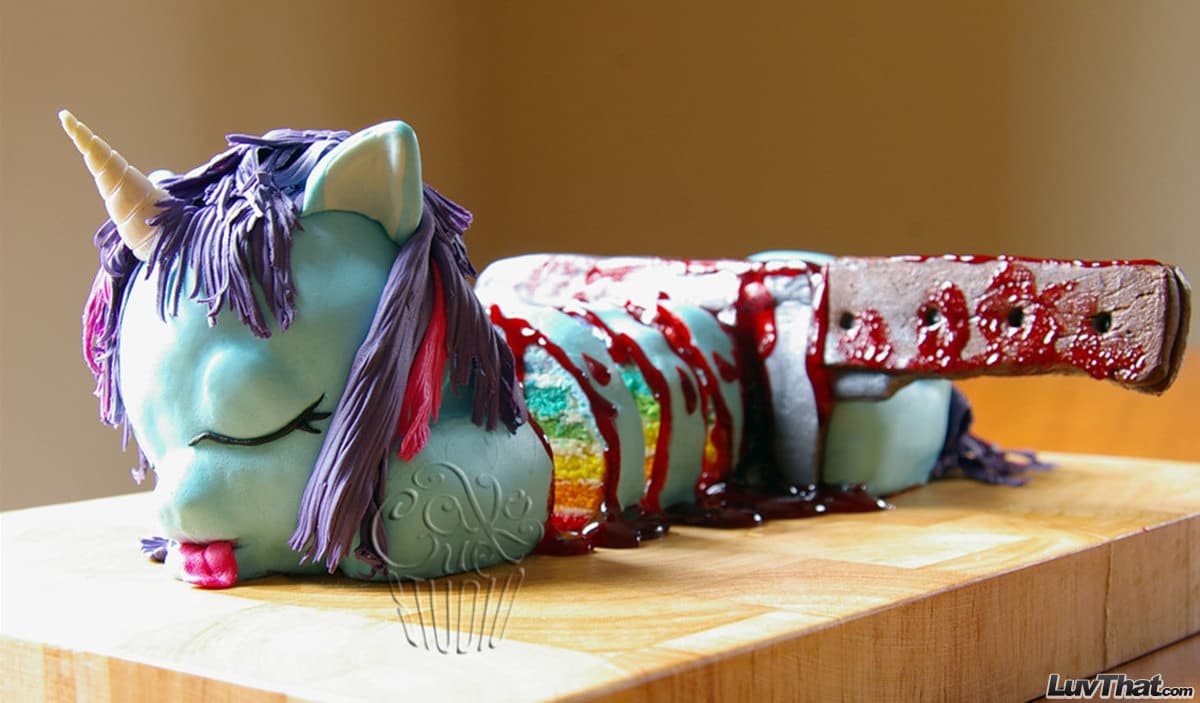
[This image was too good not to use. Source.]
Every time you do, a baby Unicorn dies.
If any font can dethrone Comic Sans as the worst and most hated font in existence, it’s Papyrus.
Its gross overuse by amateur designers should now be considered a public nuisance. In fact, at one point there was even a digital equivalent to a Papyrus “neighborhood watch” blog.
It was cool that one time in 4th grade when you used it for a report on Egypt. But that was the only time.
Avoid it at all costs.
Only Use Impact for Memes
Only use Impact if you’re making a meme that is supposed to be funny. Otherwise, it won’t be taken seriously.
Since the internet adopted it as the go-to font for all memes it can no longer be taken seriously.
Mind the Medium
Be sure that wherever your intended audience is going to consume your visual that it will be legible.
What does that mean?
For example, if you’re going to be sharing this visual on Pinterest you need to know that the majority of Pinterest users are viewing on their phones.
This means that your font needs to be big enough to read on a smaller screen that what you’re likely creating it on.
Legibility needs to more important that style.
Make sense? Good, let’s close this thing out.
Onward to Better Visual Content!
With these typography tips, you can be confident that the visual content you’re creating will be seen as professional, and deliver the kinds of messages you want.
Which of the above tips was most helpful to you? You can leave a comment by clicking here.
Leave a Reply
You must be logged in to post a comment.