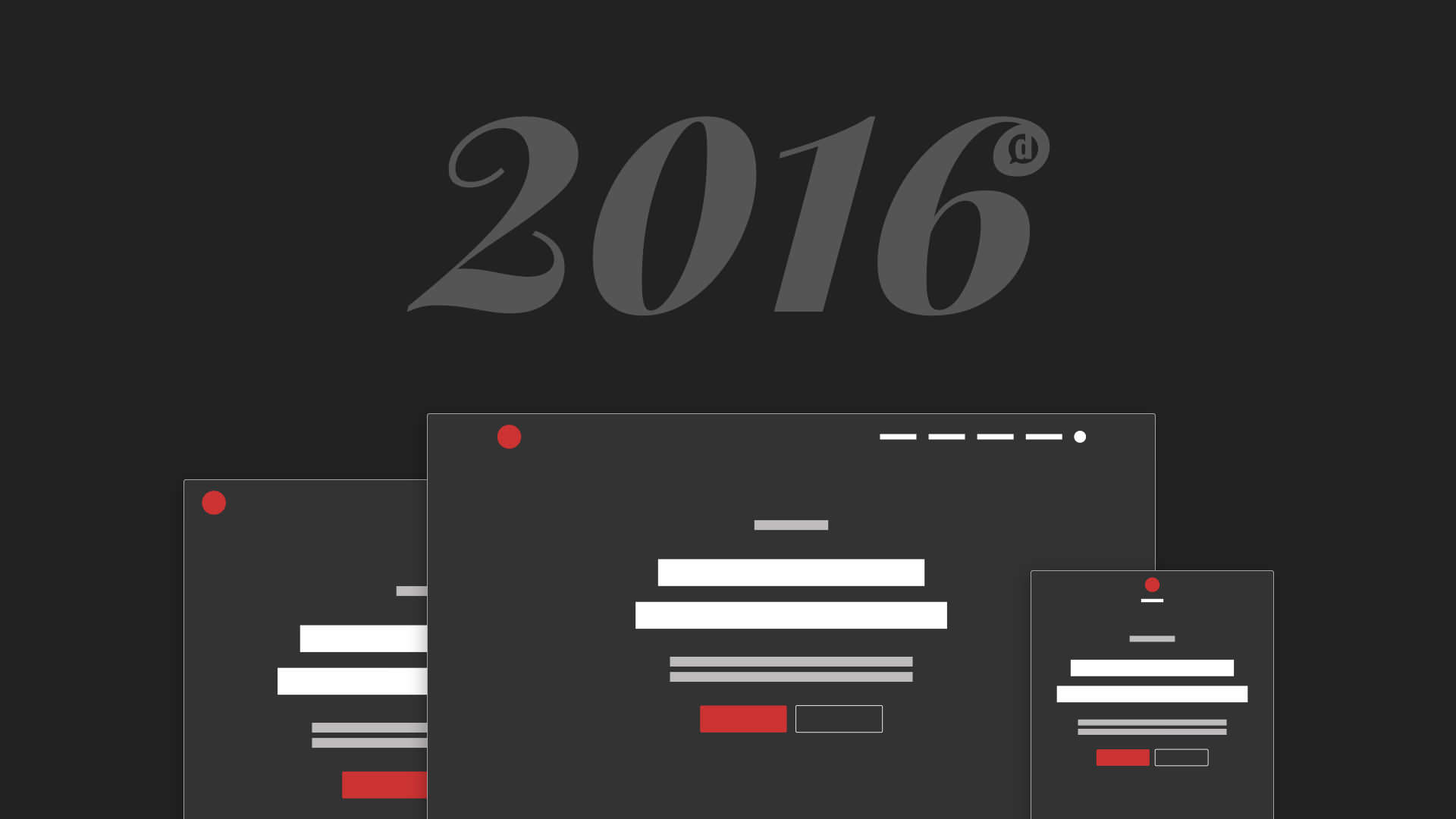
Instead of an all-out redesign, this year I decided to spend time refining. The results are delightful.
Every year since the inception of this blog I’ve done a complete redesign, generally launched at the beginning of the year. Until this year.
This year, instead of doing a complete overhaul I’ve decided to think big… about the smallest things. I’ve spent more time thinking through the tiniest details of my site design than I spent redesigning the whole thing last year.
And I think it’s really made a difference.
I’ll let you decide though as I walk you through all the details in this years blog redesign.
You may want to consider going back and reading my thought process on last year’s redesign first to add a bit more context to what you’re about to read.
Just FYI, if you want to create a beautiful website with minimal effort I highly recommend starting with a theme from Studio Press [aff link]. It’s the framework that powers this website and the only one I recommend for clients.
Typography
The most important part of any website design is the typography.
Unless of course your website doesn’t have anything to read and it’s just a bunch of photos. In that case, typography doesn’t matter.
In most cases though, typography (or the fonts, typefaces and their specifications) should be the top priority.
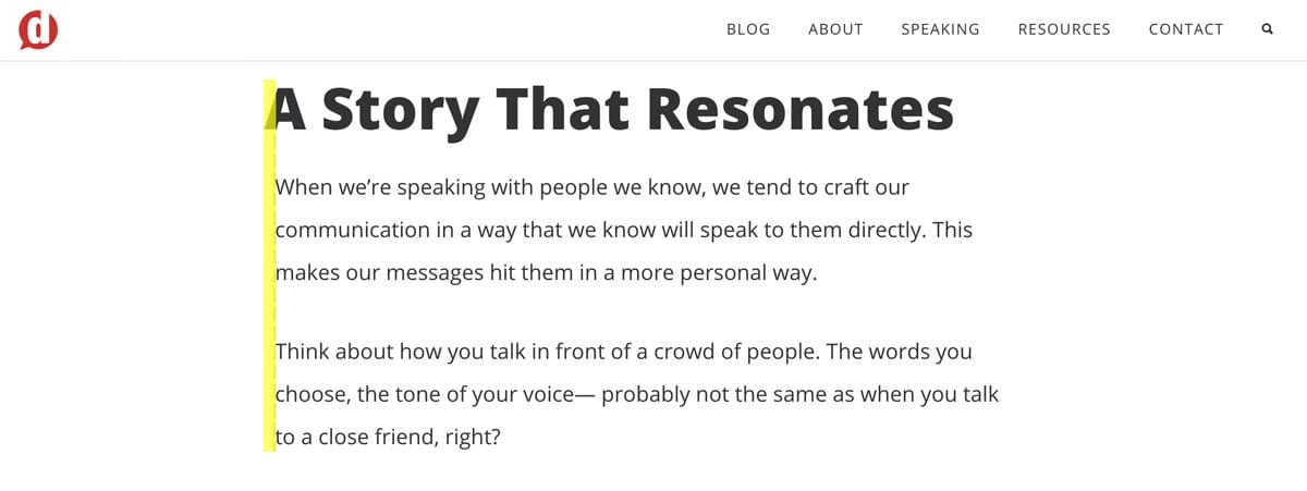
Last year I was very specific about the typefaces I would be using on this site, and I’ve been quite happy with them. However, I felt they could use some fine-tuning to assist with even better readability and visual rhythm.
Girl, look at that body
Body text is the foundation of an entire websites typographic structure. So this is where I began my fontastic refinements.
Previously my body text was set at a base of 24px and a font-weight of 300. This resulted in an optimal characters per line (referenced here) at the full-width content area. The lighter weight also had a sleek, elegant feel to it that looked very smooth on retina displays.
But the problem is— not everyone is reading on retina displays. Yet.
The lighter weight also had a greater contrast with bold text in the older version, making the bolded text a bit more distracting than it should have been. (Hats off to David Kutcher for planting that bug in my ear last year.)
So after much consideration, I decided the best reading experience for my readers would be to thicken the font to a 400 weight to ensure readability on lower resolution devices.
But this also prompted me to reconsider the optimal characters per line. At 24px tall and 400 weight, it felt too heavy. So I ended up bringing it down to only 20px and thus ended up with what you see here.
Seeing this in action gave me a realization. The text actually felt like it held more weight— like it was somehow stronger, giving the words more authority.
As I’m a bit of a typography nerd, I took a look at some of my favorite high-authority sites with excellent typography, and I realized that they all had a similar average of characters per line. And comparing with my newly refined body text styling, they were quite similar.
Maybe this is more of a subconscious thing that I’ve psychologically associated with high-authority, beautiful sites. But I suspect if I feel that way, others might too.
That’s my story, and I’m sticking to it.
Aside from the font size and weight, I’ve also done some tweaking of the line height (the amount of vertical space that a line of text takes up) and paragraph breaks.
I was recently browsing Brian Gardner’s blog and took notice of his typographic style. His line-height really stood out to me, giving me the exact ease of reading that I was wanting to incorporate.
So I stole it.
The result is a line height of 2. The easiest way to explain this for the non-designer is that it’s very similar to when you make a document double-spaced. Every college student probably can relate to that trick.
In this case though, it’s not for the purpose of filling up more space because your teacher told you the research paper needed to be 15 pages long. This is actually a way of giving the reader plenty of visual breathing room to take in each word without the previous or next line encroaching on the current line.
Additionally, I increased the distance between paragraph breaks to a comfortable 34px. This gives a distinct enough break to make it clearly distinct but not too much as to break the visual rhythm.
Headings
Ah, the glorious hierarchy of typographic layout. Headings are a way for readers to decipher sections and sub-sections within your blog posts and pages.
Smart bloggers use sub-headings to increase a blog post’s “scanability”. Intelligent writers use them to keep their thoughts more organized and ensure the story they’re telling stays on course.
It’s important to make it so that these sub-headings stand out visually, so I’ve taken some time to think through my own.
The first change I made was to create a very subtle negative indent for heading text.
A subtle -10px margin on headings makes them pop out to the left just enough to make them stand out without being obvious or distracting.
This will only happen, though, on screens larger than 1200px. But that’s a topic for another section below.
Next, since sub-headings signified a significant shift in the storyline or thought process of a post, I wanted to give them a bit of extra white space above to communicate a more significant shift than going from one paragraph to another.
I liken it to the kind of rest a musician might place inside of a musical score.
The result is a slightly taller gap between the end of a paragraph and a sub-heading.
Iconography
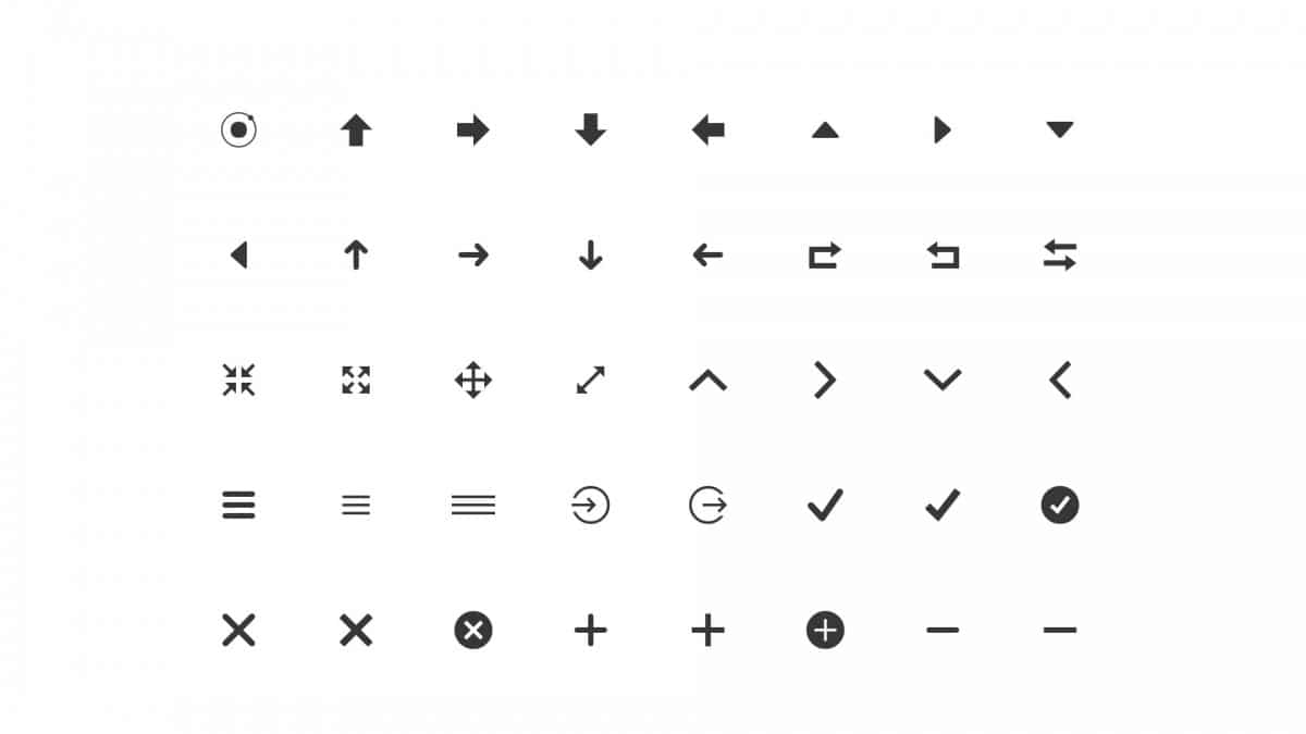
Throughout my past designs, I’ve often borrowed from several different sets of highly popular, free icon fonts to accomplish my icon needs.
- Dashicons: The official icon font of WordPress
- Font Awesome: My previous favorite
The reason I used these is because they were both free, open-source fonts, not just .pngs or .jpegs of icons. This is important because using a font instead of an image ensures that the icon will look good on all screen resolutions and they will likely load faster.
This past year, Studio Press (affiliate link) began using an icon font in some of its Genesis Child Themes (affiliate link) I hadn’t seen previously called Ionicons.
It’s another free, open-source icon font that is very well put together. And for a detail-obsessed designer like myself, they’re drop-dead gorgeous icons.
So I took some time to replace every instance of an icon inside my theme with an Ionicon version. This ensures a consistent look and feel of every icon throughout the site.
Buttons
Why, oh why, do I love buttons so much? Is it just me? Does anyone else out there just find buttons to be fascinating?
Maybe I’m just weird, but I find it a lot of fun to play with and create buttons. I guess that worked out really well for Social Warfare users, though— so maybe it’s not a bad thing.
Buttons are an important part of any website owner’s design because they are usually the devices used as calls to action.
- Click here!
- Buy now!
- Subscribe!
- Register!
- Submit!
Buttons are the universal symbols for performing an action.
So when I wanted to re-think my own buttons, I wanted to revisit my idea from last year about Action Inspires Action and apply it more aggressively to my site buttons.
I started by wanting to add an action icon to my buttons to help the visual communication of “clicking this will do something”.
So based on inspiration from the buttons I saw on the That Church Conference website (see my interview with the founder here) and a few other sites that incorporated icons in their buttons, I decided to add an arrow (or “chevron” to be accurate) to my buttons when you hover over them.
Give it a try below:
See, isn’t that fun? When you hover your mouse over the button you feel like you’re about to go somewhere.
But Dustin, why did you put the arrow on the front/left of the button rather than the right? Doesn’t the right make more sense?
I’m glad you asked… and don’t call me butt Dustin.
Initially, I placed the chevron (or arrow) on the right side of the button. But that can be kind of confusing when you place another button beside it— like on my home page.
If the button on the left has an arrow that points to the button on the right, it can be a little confusing– like the left button is telling you to click the right button. For anyone who has decision anxiety, this is the stuff of nightmares.
So, I decided it is best to place the chevron on the left side of the button, before the action text. Not only does this eliminate the dueling buttons problem, it actually makes more sense. The chevron is now pointing to the action you’re about to take!
If this is getting just a tad bit OCD for you, I won’t be offended if you stop reading now. It doesn’t get any better, I promise. The good news is my company is ready for hire to bring this level of detail obsession to your next web project.
I also wanted to have some pre-made styles for when I wanted to quickly add a “download” or “buy” button.
Now, the reason for the more static (not moving) version is that these buttons represent a more sensitive action. In the case of a download, the click of the button would begin the file transfer immediately. In the case of a purchase, the checkout process would begin.
I consider both of these to be sensitive actions since you don’t want to just trust any download link and any buy link. You want to feel secure in that action. So I decided I wanted these buttons to feel less “shifty” and more stable instead.
And lastly, I’ve created one more variation of a button that I will use for one, very specific and highly important call-to-action:
I’ve created a “pin” class that, when added to a button will replace the chevron with a Pinterest icon. This is for when I have a great graphic that I want people to be able to pin easily.
Inputs
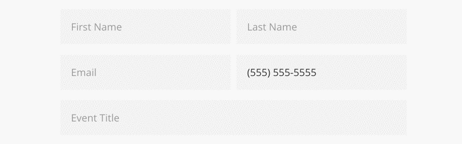
The first thing I wanted to change about the inputs throughout the blog was the color. Since the background color throughout the site is white, having inputs with the same background color felt washed out.
So I decided to give them a low-contrast grey to make them clearly stand out on a white background.
Additionally, when an input is active (when you click inside it) there is a 2px border that fades in so you can clearly know where you’re cursor is if you happen to scroll away and come back.
Mobile Responsive
The previous iteration of this design had numerous flaws when it came to smaller screens. Even though I had started with a mobile-first philosophy, I ended up trying some different things that didn’t work as well on mobile devices. And then I just didn’t have the time to go back and rework them.
Well, I’ve gone through and looked for all the problem areas on mobile screens and adjusted them accordingly.
Font sizes across the board have specific adjustments that are made at the tablet/mobile level. Margins and spacing are also slightly adjusted to keep the visual rhythm consistent.
This site has never been more attractive on mobile devices.
Insider Downloads
For those of you who are lucky enough to call yourself Insiders, you would have gotten my email notifying you about a significant upgrade to your private downloads page. Since that email, I’ve made a few more tweaks to increase that page’s aesthetic and layout.
I wanted to first update the page by organizing the downloadable content into categories. Then I also wanted to make the download boxes a bit more modular and have a small description for each download just in case you weren’t familiar with what the item does.
This page will continue to get upgraded throughout this year as I decide on a better way to organize and distribute the downloads I give away to my Insiders.
You’ll notice I’ve also added a contact form on that page so that you can send me feedback or requests right from there.
Consistency in Every Single Pixel
Overall, the major theme of my meticulous refinement has been to establish consistency in every detail.
One example of this attention to detail is that I’ve gone through and made sure that anywhere that a border is added (like when an input is active) the border is 2px.
Notice the navigation bar at the top of the page as it follows you down— 2px border at the bottom.
Buttons, when they have a border, always have a 2px border (as opposed to 3px previously).
Everything that has a border is consistently a thickness of 2px. A small detail that subconsciously communicates that this is not some hacked-together, disconnected quilt of a website. It’s a unified, coordinated and intelligently built entity.
That’s what every website owner should strive for.
One Last Thing
If you’ve made it through this entire article, I applaud you. If you’re fascinated with this sort of thing, you’ll probably like taking a look at the ever-evolving Style Guide page I’ve created.
It will be constantly evolving just as this site does and might be a good way for any aspiring designers (or digital do-it-yourselfers) to find inspiration or learn how I approach things.
Now, go build something beautiful yourself.
Leave a Reply
You must be logged in to post a comment.