Method to My Madness: Blog Redesign 2013

There’s more to web design than just making things look pretty. There’s a method to the madness and in this post I want to share some of my redesign madness with you.

It’s been one full month now since I released my new blog design into the wild. By the grace of God, I have got nothing but positive feedback! In fact, I’ve had several requests from people to have me build them something similar (if not exactly the same).

My hope is that through reading this you may understand not only what has changed, but why. This is so you can take these same concepts and philosophies and incorporate them into your own blog design.


Why the redesign?


You may have been around about 6-7 months ago for my last redesign. This was right when [st] 3 was released. The old design served me well and even brought me a great deal of business.

As a web designer though, my personal site is my greatest showcase. Therefore, I decided that it was vital for me that my blog showcased my skills as well as my values as a designer and consultant in the most up-to-date way possible.

I’ve decided that every year, at the beginning of the new year I will unveil a new design for dustinstout.com. I think this is infrequent enough to not be overbearing on my readers and just frequent enough to keep up with the latest web trends.


What all has changed?


I’ve broken this down section by section. While I don’t list every single little detail, it should give you a general idea of the major modifications and the reasons for them.
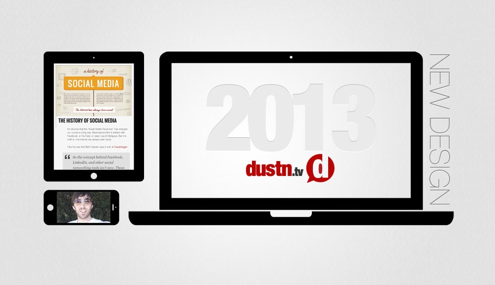
Bigger Everything

go bigger or go home

The first thing you probably noticed is that everything is bigger. As opposed to being a standard 960px wide, I decided to go with a 1200px wide presentation for the desktop version.

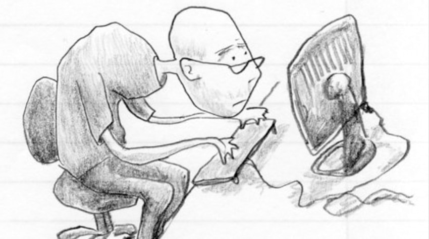
Optimal reading experience is the goal. Making things as readable for you as possible. I don’t want you feeling like this when you visit my site…

hunched over computer

Instead, I want you to feel like this…

relaxing-with-laptop

I want you to be able to comfortably sit back and not have to hunch over your computer screen to read through my posts and pages. Hooray for good posture!

This bigger-ness is further enforced by the other changes that follow.

No More Containers!

get rid of the box

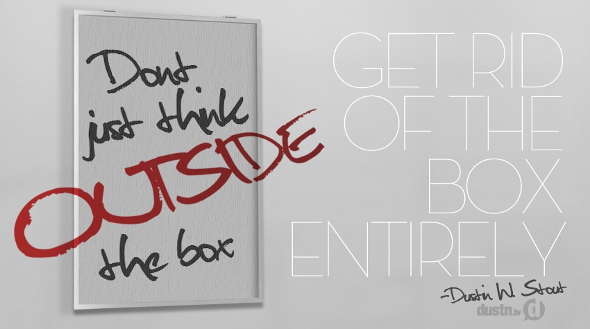
I got rid of the content containers. I found that the blogs that didn’t have containers around their content felt more open, more free, more solid and yet more soft and inviting at the same time.

This idea was solidified by 37 Signals’ blog redesign. They did a great job of explaining it, and I agree with them 100%. They propose that content that is held within a container feels more “temporary”, whereas placing it openly on the background of the site seems to give it a sense of worth.

Crafting for Social

sharing should be easy

My previous design incorporated a floating share bar (courtesy of Digg Digg) that remained on the left side of the blog post and floated along with you down the screen. While it was functional, and a very popular implementation among socially savvy sites, it felt like it was imposing on the reader’s experience.

On mobile devices, the bar was just off-screen and completely un-usable. Not very practical.

So instead, I added the social sharers at the top of each blog post and below each blog post. This solved the mobile issue and also got out of the reader’s way while scrolling through the blog post.

You’ll also notice that the first set of share buttons are directly in the title of each blog post. I had this revelation thanks to my friend Peg Fitzpatrick who kindly tested out my new design before I released it publicly.

She brought to light the fact that if a reader is on the home page and doesn’t know to click-through to the full post, they have no easy way of sharing a post. I had never thought of that before. If someone wanted to, for instance, add it to their Buffer for later, they would have to click-through the post, wait for it to load then share it. Not exactly seamless.

So having the sharers directly in the title of the post allowed people to be able to share from the home page, should they so desire. More seamless sharing.

More Visual

vintage camera

Imagery helps readers to connect on a different level with your content. It engages a different part of the brain making the connection to the content stronger.

Thanks to the rise of Pinterest, Google+ and other social networks that emphasize imagery, the web has got a lot more visual. I’ve always added a feature image to my blog posts, but I believed it was time to take it to the next level.

Since the site is bigger it allows for bigger images. Bigger images make for better sharing on sites like Pinterest and Google+. And as research (and recent viral success) shows, images get more attention and are shared more than just plain text.

As a graphic artist, it is yet another opportunity to showcase my work and the power of visual communication.

Even Better Typography

typography is vital

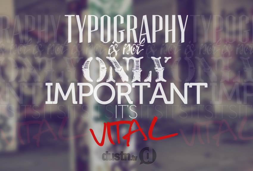
I was intentional before about typography, but I’ve now made some significant tweaks to make reading text even more pleasant. Obviously the bigger site allows for bigger font, but that’s not all I did.

Now, if you’re on a Windows device, you may not be getting as much of an improvement as those on Apple devices, but you should still notice a change.

My titles are bigger and bolder than ever, along with my sub-headings. This allows for easier scanning for those in a hurry, and helps break things up a bit.

The paragraph font is my good friend Helvetica (or Arial for Windows users) but noticeably thinner. I dropped the font weight a bit to give it a crisper, lighter feel.

De-clutterification

In an attempt to make things less cluttered, I looked for every opportunity to get rid of unnecessary visual elements. The first thing I got rid of was my header.

old dustinstout.com header

Instead of having a big header image taking up space between the navigation bar and the content, I decided to free up that space and just nix the big header. Then I moved my logo into the navigation bar, making sure that my brand was still prominent.

The next thing I started chopping away at was my sidebar.

I reduced the number of ad spots I offer in my sidebar. This makes the few spots that I do offer more valuable and gives me less to manage. Both of those things are good for business.

I also decided to nix my “Recent Posts/Comments” widget. While it was a very pretty widget, I realized it just wasn’t necessary.

Meticulous (borderline obsessive) Responsive Engineering

Mobile continues to rise. With smartphones overtaking the marketplace, more people are spending their browsing time on their mobile devices. For this reason, it is vital that your blog design caters to this crowd.

Mashable talks about this in the explanation of their recent redesign. Taking their brilliant advice for “mobile first” I’ve also made sure to design for the best possible experience on every screen size.

This is made possible through [st]’s responsive framework and a lot of testing. I have specific styles, sizing, and optimized settings for each possible screen size. This wasn’t easy, but it was well worth it.


Sites That Inspired Me


To make sure credit is given where it’s due, here are the primary sites that served as inspiration for my redesign:


Final Thoughts


Now as a designer it’s always tempting for me to tinker and make continuous changes. However, everything I’ve outlined above, from a design perspective, is pretty set in stone for the next year. I may make some minute changes here and there (that most people won’t notice), but nothing major.

There are a few functional features that I’m working on developing that will enhance some of the things I’ve talked about above, and as soon as I am able to roll those out I’ll be sure to update you again.

I hope you have enjoyed the changes.

Bonus: Free Child Theme for subscribers!

Now that my new design is fully integrated, I’m now going to be giving away my old child theme to my subscribers. I will be sending out the download link in the next week so if you haven’t subscribed yet, now would be a good time. The child theme does require that you already have [st] installed in order to use it, in case you aren’t familiar with what a Child Theme is.

What is your favorite part of the dustinstout.com redesign?

Dustin W. Stout Avatar

36 responses to “Method to My Madness: Blog Redesign 2013”

  1. Dustin W. Stout Avatar

    Thank you Moira! I’m a professional web designer, so I took great care in figuring out how to make that work best. I’m also using Genesis framework and utilized several components from different Genesis themes to come up with what you see here. 😀

  2. moira Avatar
    moira

    Hi Dustin,

    What an amazing website design – I love it!

    I love the way your header is hidden until you start scrolling. I am in the process of upgrading my site to the Genesis framework and would love to know how you did that if you wouldn’t mind sharing.

    Awesome blog too!

  3. Dustin W. Stout Avatar

    I would love to have you cite some of my posts! As long as you aren’t copying and pasting them (bad for SEO). A citation or even a small snippet with a link back to the original is great!

    My goal is to post 3 times per week– but life can get busy so I don’t post as frequently all the time. Your best bet is to subscribe to my email list so you only get notified when I post something new.

  4. impacto Avatar
    impacto

    Do you mind if I cite a few of your posts as long as I provide credit and sources back to
    dustinstout.com? My website is in the exact same niche as
    your own and my readers could undoubtedly learn from much of the knowledge you give here.

    Feel free to let me know if this would be fine.

    Regards
    . It’s made me remember the reason why I loved this blog so much.
    Thank you, I will try and check back more often. . How frequently do you post on your blog.?

  5. Dustin W. Stout Avatar

    You are very welcome! I’m glad you liked it David!

  6. Dustin W. Stout Avatar

    Thanks Rodlie! Feel free to use my contact page to drop me a line!

  7. Rodlie Ortiz Avatar
    Rodlie Ortiz

    Dude, this design is sweet. Much props. Gonna hit you up in the future for sure for a redesign of mine. I could use a refresh.

  8. Dustin W. Stout Avatar

    I hard coded them into the theme files. Not easy, but definitely worth it.

  9. Justin Dela Cruz Avatar
    Justin Dela Cruz

    Lookin good. How do you get the share links to appear in the title of posts?

  10. David Avatar
    David

    Excellent article. It’s been a long time since Ive seen such drastic measures be taken, but well put together to explain why exactly you did what you did.

    I will be reading up on the article on the 37Signals Blog, But thanks so much for this great article!

  11. Dustin W. Stout Avatar

    Thanks Shawn!

  12. Shawn MacKay Avatar
    Shawn MacKay

    Lookin’ good!

  13. Dustin W. Stout Avatar

    Take whatever you like Ray! 😀

  14. Dustin W. Stout Avatar

    Thank you Peg! #yourock!

  15. Ray Avatar
    Ray

    best part of it all for me: Go Big or Go Home! I am a tall guy and do not like to be bent over all day trying to read something… bigger is better! Great job! I am a fan of the sidebar category buttons (I might take that idea into mine!, hope you don’t mind).
    Ray

  16. Dustin W. Stout Avatar
  17. Peggy Fitzpatrick Avatar

    Fantastic article explaining your design choices and WOW what an amazing new site you have! I shared it all over the socialsphere. It’s gorgeous and I love all the custom designed elements throughout. 100% pinnable and shareable.

    Smart, smart smart!! Thanks for the shout and that I gave you a little idea. 🙂

    I wish you all the best with your new theme.
    Peg

  18. Eric Dye Avatar

    This is awesome, Dustin. I love it!

  19. Dustin W. Stout Avatar

    Wow– thanks so much Jason! I really appreciate your compliments! Like really really!

    I never saw that Pixar short until I went searching for it just now. It took me a while, but I did find it! A great short indeed! And yes, I am currently a one man band for everything here on dustinstout.com except for my wife who serves as my editor (most of the time).

    The “fog” effect is a css filter (Greyscale) and currently only works in Chrome. I don’t anticipate it will cost me shares, but if it does I think it a worthwhile sacrifice for a less cluttered reading experience for the user.

    I hadn’t noticed the featured image stays clickable– totally missed that one!

    I got rid of my Facebook page last month– never had much ROI there.

    And I love my .hrs! lol

  20. Dustin W. Stout Avatar

    Thanks Chris! 😀

  21. Dustin W. Stout Avatar

    Yes– a rather large chunk of code that needs to be added to your child theme style.css file. If you have a [st] support license then you can find the tutorial in the Support forums. All I did was copy exactly what they outlined to do.

  22. Jason Avatar

    Dustin, I gotta tell you, since I first discovered you on Churchmag hangout #1 I’ve been following you on G+ and here. Man you really are one of the most talented graphic artist online today! I mean it. And the fact that you wrap your premium blog content with a commanding understanding of marketing, Social Media, and SEO has landed you on my top ten list of “must follow online personalities”.

    You remind me of the Pixar short “One Man Band”. OK Maybe not, but you get the point. You must have a team helping you with all this!

    God has surely blessed you my brother!

    (I like what you did to fog the social media buttons until hover, but I wonder if the design will cost you shares. Wonder why you did not add 16px social icons to the footer, Why reload the page when the featured image is clicked, I would set conditional tag to turn this off on single.php, totally agree with your assessment of Digg Digg, your typography is awesome, love that FB is missing from your Social Networks, Classy CSS .hr effect)

  23. Razzle Avatar
    Razzle

    Thanks Dustin! Is there any way to change the width of the Standard layout from 900px to 1200px?

  24. Dustin W. Stout Avatar

    I am self-hosted. I use Bluehost [affiliate link].

  25. Dustin W. Stout Avatar

    Well thanks John! I’m pretty proud of it, but not sure I’d go as far as calling it ‘holy’. 😉

  26. Dustin W. Stout Avatar

    It really does make a difference Artur! But what sucks now, is you will always notice it on every site– lol sorry!

  27. Dustin W. Stout Avatar

    Thanks Chris! I guess I did forget to touch on the bottom sharers! Doh! But you said exactly what I would have explained.

  28. Dustin W. Stout Avatar

    I actually contemplated losing the sidebar too Tyler. For certain posts and pages I will be losing it though. I love that [st] make it easy to decide on a post-by-post basis.

  29. Dustin W. Stout Avatar

    Add this line of CSS to your Child Theme style.css:

    .post { background-color: transparent; box-shadow: none; }

  30. Mark Clifford Avatar
    Mark Clifford

    Dustin,

    It looks great. I have one question. Are you self hosting wordpress or using the .com version?

    Also I appreciate the download coming. I will be using it soon

    Thanks
    Mark

  31. Chris Langille Avatar
    Chris Langille

    Yeah, what John said.

  32. John Saddington Avatar

    holy shit. great job!

  33. Artur Avatar
    Artur

    When I read the text on this site or any site that has implemented these font ideas and then I go back to some of my sites with small text that’s crunched up together I immediately see how changing it would help increase many of the importnat metrics, including a better CTR.

  34. Tyler Hess Avatar
    Tyler Hess

    I wouldn’t mind knowing that as well, but what I really wanted to say is that what I’ve been noticing not only on this site but others as well is that I enjoy the move toward less clutter on websites. I’m still contemplating if I even want a sidebar at all on my next, soon to be announced blog.

  35. chris wilson Avatar
    chris wilson

    Great explanation Dustin and I’m interested to take a peak under the hood of your old child theme too! I love learning things by investigating.

    I think your site really does have a great reading experience and love it for that. You didn’t mention the sharing buttons at the bottom of your post (maybe they were there in your last version) I think that’s a great prompt for a reader. They finish and then you invite them to share if they liked it.

    Great stuff.

  36. Razzle Avatar
    Razzle

    How’d you remove the containers? How do you do this in Standard theme? Mind sharing how?

    Awesome Dustin!

Leave a Reply