If you’re not a designer, all the color psychology and strategy in the world might not help you narrow down a solid color combo to create your personal branding.
Once you answer the question, “what colors do I want to use,” you then have to answer, “what hues of which colors should I use?” Then you will probably have to narrow it down with, “how many colors should I use?”
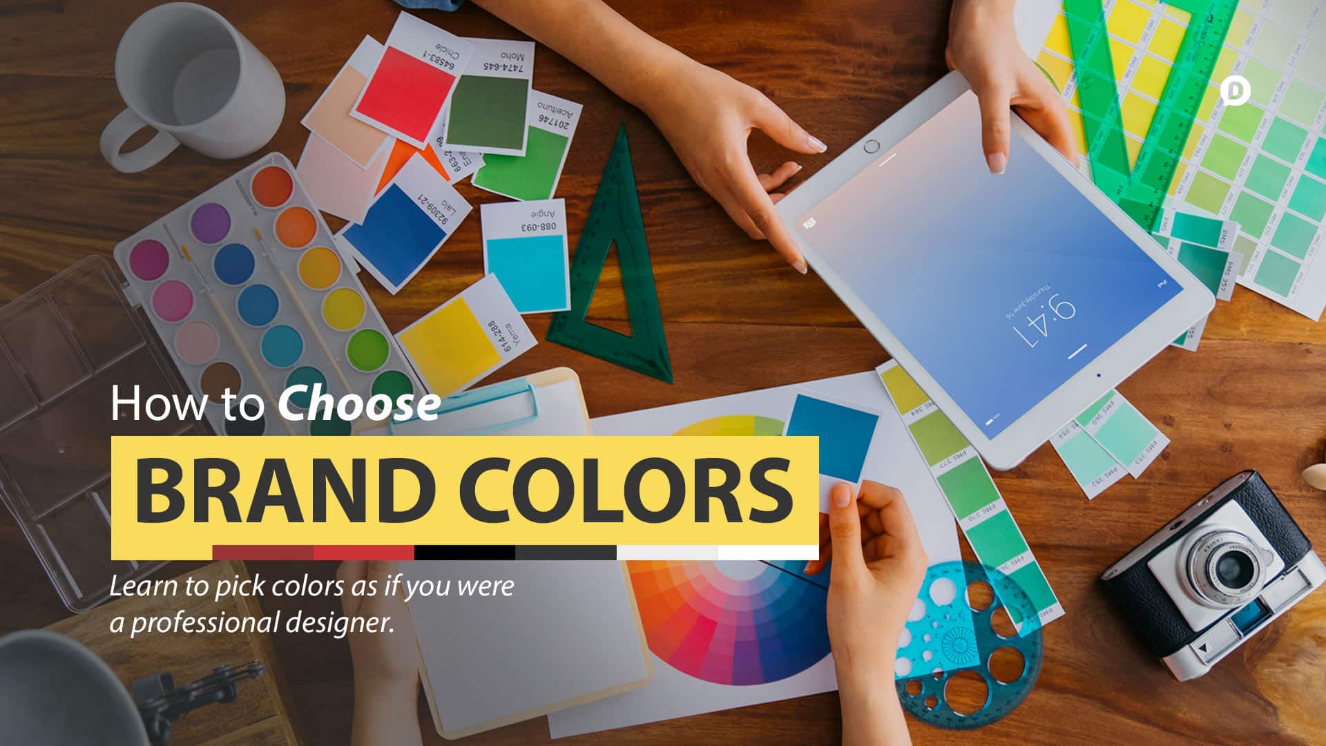
I’m going to attempt to give you a simple, practical guide to choose your brand colors like a pro.
This is part of the Blog Design Essentials series. Check out the rest of the posts by clicking here.
How many colors should I use?
If you were to go and visit the top blogs in the world, specifically looking at the colors they incorporate, you would start to see a trend. Most big brands are using two or three colors in their design. The most well executed brands will have two primary colors and one accent color that pops against the other two. So here’s the formula:
2 + 1 = optimal color palette
When it comes to blog design and creating your personal brand colors, it’s best to use a maximum of three colors. Two primary colors and one accent color should be the basis for your color palette. You can use as few as 2 colors, but never exceed 4-5 colors in your design. Keep it simple, keep it specific.
Take my site for example: when you look at dustinstout.com (or even dustn.co) you’ll notice 3 primary colors– red, black, and grey. I chose to stick with two neutral colors and one accent color. I kept it super simple for my personal brand because it’s easier to stay consistent, and simplicity makes a longer lasting brand impression.
Now, if I’m being honest, technically I have 6 colors in my palette. I know– what a hypocrite! But hang on before you throw me to the lions! When I come up with the primary colors in a design, I will choose either a slightly lighter version, or a slightly darker version to use as highlights/lowlights within elements. This makes for great gradients so that the colors aren’t always flat– they have some depth to them. I know that sounds really confusing, so let me show you exactly what I mean:
Base color palette:

Color palette with highlights/lowlights:

The “dustn” part of my logo is red to emphasize and draw attention. I needed to do this because I wanted to make sure people remembered the unique spelling. It’s d-u-s-t-n; dustin without the ‘i’. Using a bold, attention-getting color makes it more likely for a visitor to see that it is spelled differently. At least that’s the hope. Plus, red is just my favorite color– so of course I had to use it in my logo.
To give the logo a bit of depth, I used 2 shades of red to create a gradient (one color transitioning into another). I also use red for the color of links throughout the site. Aside from navigation links, any text links on this site are red to draw your attention. I use a slightly lighter black color for my navigation elements, and post titles. It has the highest contrast and plays nicely against my background color. It’s a bit lighter pure black to, again, add a bit more visual depth.
For my background color I use a very light grey. It is only a smidgen (technical measurement) darker than white. I did this because grey gives a slick, modern feel and can be partnered with white as a hue without complicating the palette too much. So you see, there are two primary colors plus one accent color that I stick to, with a variation of each that will allow me to add a bit more depth to the design elements.
Make sense? Good. Now how in the world do you make your own palette? Good question, I’m glad you asked it.
Tools to Help You Choose Colors Like a Pro
I wish it was as easy as just thinking up your favorite colors and putting them together. Unfortunately, good design takes a bit of an eye for color coordination. Luckily there are tools out there that will help you find the perfect color palette for your blog design project. Here are the two I use regularly:

This is my first choice when I’m looking for color combo ideas. This is a user curated database of all sorts of beautiful color palettes.
Using what I’ve outlined in this post, you should be able to search through ColourLovers.com and find a palette that fits exactly what you’re trying to do. With ColourLovers.com you can search through the thousands of palettes by keyword, hue, hex code, and a few other specifications. You can even search through popular brand colors!

This is also a great tool for looking up user created color palettes. It’s not quite as user-friendly, but still a great tool to use.
Let’s recap
Since bullet points are highly effective and more actionable, here’s the three sentence, bullet-point version that would have probably saved you 4 minutes of reading time:
- Decide on two primary colors and one accent color.
- Find a perfect color palette using one of the two websites mentioned above.
- Stick to these colors only when designing your blog.
Once you find the palette that works for you, save the values somewhere they’ll be safe and easily accessible. Now you can really begin your blog design implementation. Use your new branding colors, and only these colors, throughout your blog design and you will have created a professional grade branding palette.
So what two or three colors are you working into your personal branding palette? You can leave a comment by clicking here.
Leave a Reply
You must be logged in to post a comment.