The Essential Guide To What Colors Communicate

what colors communicate

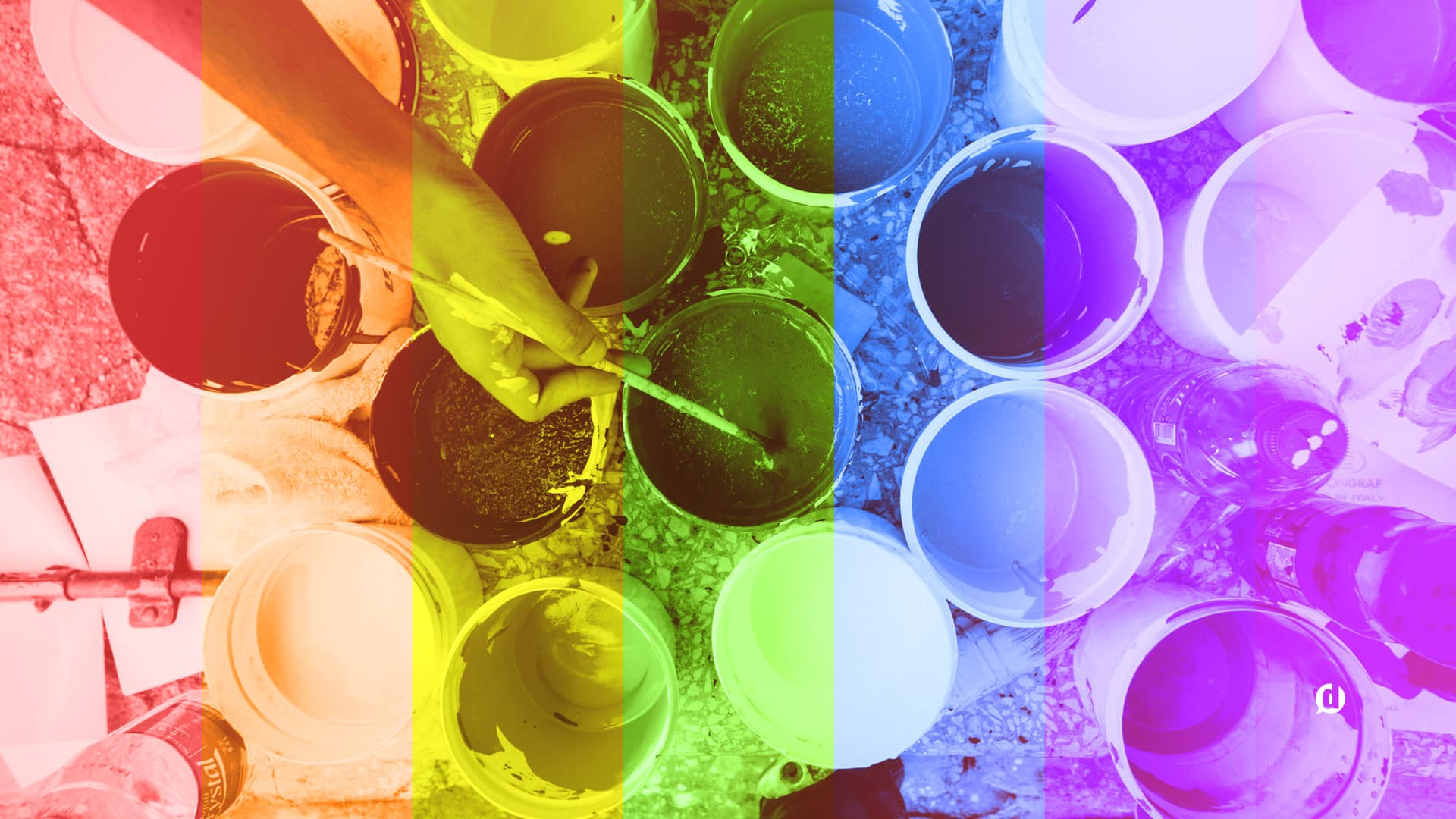
Did you know that colors communicate? The use of color in design can be an essential part of how your visual aesthetic perceived.

Color usage can either make or break your designs, and I will show you how to choose your colors wisely by understanding what they communicate.

When new visitors land on your blog, the first things they interpret are colors. Before they read a single character, their brain is registering colors which are subconsciously (or consciously) tied to emotions, states of mind, or preconceived ideas.

If you do a poor job at putting together the colors in your blog design, it can be detrimental to the growth of your brand.

I’ve come up with an essential guide to what colors communicate, as well as a quick infographic to reference that is free to download!

This is part of the Blog Design Essentials series. Check out the rest of the posts here!

And don’t forget to get on my Insiders list to get exclusive content (even better than this post!) and access to a growing resource page of downloadable Goodies. Get access by adding your email below:

What do colors communicate?

You may not know this, but colors have a very significant effect on us both psychologically, and even physiologically! Certain colors can change our state of mind, or even affect our physical state. Is that crazy or what?

Lucky for you, I’ve gathered the research and put it all in one place for your reference. I’ve even put together an infographic at the end for you to download and share! First, let’s break these colors down one-by-one:

Red

red-communicates
This happens to be my favorite color– as if you couldn’t tell. Red is the most eye-catching and exciting color in the entire spectrum. It’s eye-catching, exciting, and demands attention. But did you know that the color red actually increases your heart rate?

It is perfect for accent colors, calls to action, or anywhere you want to draw people’s attention. Be careful though, because overuse of this color can cause a negative emotional response.

Orange

orange-communicates
Probably my second favorite color. Orange is also an attention getter. Distinct from red, orange is a color that is mostly associated with fun, ambition, and youthfulness.

It is also a great color to use for accents and calls to action. Unlike red, it is not as easily overused.

Yellow

yellow-communicates
This is the official color of optimism and happiness. Maybe that’s why smiley faces are always this color. Studies have shown that the color yellow actually causes the release of serotonin in the brain, which is a chemical that positively stimulates your brain. Basically, it produces “happy” chemicals!

This color is also best used in small amounts. Too much yellow can be overpowering and shouldn’t be used as a dominant color in a scheme.

Green

green-communicates
This is the easiest color for the human eye to process. It’s easy to look at and is associated with growth, nature, and money. It can also be a very relaxing color for some, which is why you’ll see it used in a lot of leisure and “zen-like” design.

If your goal is to communicate growth this is the color you want to use.

Blue

blue-communicates
The color of trust and loyalty. Blue is associated with calmness and security. Most people would say that blue is their favorite color. It has been documented to lower heart-rate, foster relaxation, and increase productivity. Maybe this has something to do with why a billion people trust Facebook with all their most valuable information? Just a thought. 😉

This is a very safe color to incorporate into your design. Since it’s most people’s favorite color, you’ll immediately appeal to a wider audience.

Violet

violet-communicates
A color that has traditionally been associated with royalty and prosperity. Studies have shown that the color purple actually stimulates problem solving in the human brain. That’s interesting.

Caution though, studies have also shown that overuse of this color can give people the impression of falsehood, or being fake. Use this color as an accent, and sparingly.

Grey

grey-communicates
A solid, timeless color that communicates strength, sturdiness, and longevity. Likely because things that are grey have these same attributes: steel, concrete, stone, Apple products, etc..

You can never go wrong when incorporating this color into your design project. It can be a great alternative to white, and give things a modern, yet timeless, look.

Brown

brown-communicates
Earthy and organic is what best describes this color. Dirt, trees, potatoes– all things found in the earth. It’s also the color of my favorite beverage– coffee! When used properly, it can be a soothing element and give an organic feel to your design.

White

white-communicates
The lightest color both visually and in psychological weight. It gives a light feel to your design, and is best used to give your design breathing room. Associated with purity, cleanliness and clarity I think white is a great color to incorporate into any design.

Black

black-communicates
The color of elegance, power, and authority; boldly stated and seemingly unshakeable. If you’re trying to communicate strength be sure to incorporate black into your design.

I am of course talking about all these colors in their most basic form. Surely a neon-green will be more attention-getting than a dull red any day of the week. So these are merely a starting point and general guide to what colors communicate.

Quick Reference Infographic

I’ve created this simple chart for you to download and reference for your current or future projects. Please feel free to share!

visual guide to what colors communicate

[Click on image for full size.]

Unfortunately I have way to much to say about picking the right colors, so instead of making this post the size of a small novel, I decided to break it up over 2-3 different posts. In my next installment of the Blog Design Essentials I’ll address how many colors to incorporate, and helpful tools to put together the perfect color palette.

Has any of this caused you to re-think the colors you are currently using in your blog design? You can leave a comment by clicking here.

Dustin W. Stout Avatar

51 responses to “The Essential Guide To What Colors Communicate”

  1. Dustin W. Stout Avatar

    Hi, Meghan! Glad you found it useful. I haven’t done any male vs. female color psychology research as of late, and wouldn’t know where to point you besides Google search. If you find anything interesting, do let me know! This post is due for an update soon.

  2. Meghan Avatar
    Meghan

    This post was really helpful, thanks! I’m also looking for information on what colors appeal more to men vs. women. Do you know of any articles or have any other blog posts that can help with that?

  3. Dustin W. Stout Avatar

    Hi, Ridley! Yes, it’s absolutely helpful as a call-to-action in marketing. As long as you’re using it as a contrasting color and not in an overwhelming way.

  4. Ridley Fitzgerald Avatar

    It’s cool to learn about colors and psychology. Red is my favorite color as well, so it’s cool to know that it can increase your heart rate. Is that helpful in a call to action for marketing?

  5. Brandon Lazovic Avatar

    Good post! I actually had a client asking me about strategically using colors on their site to produce desired actions with their customers. Although there’s value in choosing specific colors based on what they symbolize, I told him to play with the coloration on the site first and we can play around more once he chooses a color scheme that he likes beyond the current white and gray.

  6. Dustin W. Stout Avatar

    Awesome Allen! If you need any further help, just reach out via my contact page.

  7. Allen Basom Avatar
    Allen Basom

    Dustin: I’m using your site as one of my references for a college presentation about the role of color in non-verbal communication. Very useful. I’ve “borrowed” that graphics you included with each color for use in my presentation. Rest assured you will be referenced as the source of the graphics, I believe in giving credit where credit is due. Thanks for the info, you’ve been very insightful and helpful.

  8. Dustin W. Stout Avatar

    Hi Alexandru! I think your implementation is fine. You’re not using a gaudy purple so it’s not overwhelming at all.

  9. Alexandru Avatar
    Alexandru

    Hi,
    I chose purple as my site’s basic color, and my newsletter subscribe form’s button is also purple. Is it ok? Is there any problem that would cause people think of “falsehood, or being fake”? I think it would help you answer if you take a look yourself (it’s a popup just like yours when you wann leave the website). Website’s address is in this form’s Website field.
    Anyways, your article was really helpful to me, thank you!

  10. andrea Avatar
    andrea

    I love it, la explicación fue precisas, gracias.

  11. abington Avatar
    abington

    thanks dustin for this great stuff.

  12. Dustin W. Stout Avatar

    Yea, it’s fascinating how color psychology can change from culture to culture.

  13. Eliza Olson Avatar

    There are books published about cultural differences regarding colour. I was given one when I retired from teaching. If I can find it among my books I will forward the name. I know one of the reasons that teachers are changing from red to green when marking papers is due to cultural differences in our ever changing cultural fabric.

  14. Husain Ansari Avatar
    Husain Ansari

    I go with Yellow and Green. This article helped in my presentation. Thank you.

  15. Gio Lester Avatar
    Gio Lester

    Should I be so lucky, I will! I love communications.

    – Gio

  16. Dustin W. Stout Avatar

    Gio I don’t know of any sources off hand. My research has mostly been from an American cultural perspective (that’s all I know). If you end up finding such a resource, please share it with me!

  17. Gio Lester Avatar
    Gio Lester

    Dustin, do you know where we could find some material touching on the cultural perception of colors? For example, red in some Asian cultures is prosperity and white is for death. I have been looking without much luck.

    And thank you for the quick reference.

  18. Dustin W. Stout Avatar

    I’ve read so many articles it’s ridiculous. I wanted to cite a few of them, but for one reason or another I didn’t. A quick Google search will find some great resources.

  19. Sean Lancaster Avatar
    Sean Lancaster

    Hello Dustin. Thanks for the resource. I am wondering how you arrived at these results. I know you mention, “studies show . . . ” on some of the colors and not on others, but I am curious about this underlying research. Do you have some resources that back up the claims here? Thanks bunches.

  20. Dustin W. Stout Avatar

    Thanks for the compliments Malinda! I didn’t create the graphic in a large enough print format… email me though – dustinstout.com/contact/.

  21. Malinda Avatar
    Malinda

    One of my coworkers directed me to your site. I teach a Design class at the high school level, and have a lesson on the use of color and the meanings behind them. I love your reference infographic and would love to have it in poster form for my classroom for my students to use. Any chance of that? I know I’m not the only teacher out there thinking this! Thanks for the great info!

  22. Eliza Olson Avatar

    I run an environmental education organization, the Burns Bog Conservation Society. This information is just what I need. everyone thinks because we are an environmental organization that we need to overdo the “green” when it is actually another message that I want to get across. e.g. blue, touches of red and even grey. I like what you say about brown. There was a Canadian organization that used brown a lot and I liked it. Now they have completely changed their emails and I miss the way they used brown to separate news articles into white boxes with the brown background.

  23. Dustin W. Stout Avatar

    Awesome Calvert!

  24. Calvert Trust Exmoor Avatar

    Really interesting post, thanks, given me something to think about.

    I’ve signed up for your updates now, and got a gravatar thanks to you too!

  25. Hesham Atef Avatar
    Hesham Atef

    Thanks Dustin for your effort, I’m sure that will help much people.

  26. Dustin W. Stout Avatar

    Your dad must be a very wise man! Haha!

  27. Dustin W. Stout Avatar

    Haha! You’re not the first one to say that! And no, it’s just a weird angle. Lol

    And thanks so much for the kind words!

  28. Lucille Williams Avatar
    Lucille Williams

    Dustin…what a great post and so informative! My dad always told me what you stated about the color blue. I guess dad was right. I am going to clink over to my blog and pay attention to the colors. Thanks, love this post!

  29. kelly hansen Avatar
    kelly hansen

    Dustin, is it me or is one of your lens missing in your profile pic? 😉
    I just came across your creative brilliance today and will be following you going forward.
    Thanks for the color reference chart. Very intuitive.
    ~kelly

  30. Dustin W. Stout Avatar

    Thanks Ivan! I really appreciate that! There is no better compliment than the fact that you think it is worthy of sharing.

  31. Dustin W. Stout Avatar

    Orange is a great choice Tyler. And I’m with you on the “blue being overused” thing. Have you tired going on the sites that I mentioned in the next post in this series?

  32. Tyler Hess Avatar
    Tyler Hess

    I go with orange, mostly because I always loved the color and they are my alma mater’s colors, but also because I have read the “energy/youthful” part before as well. part of me wants to go with blue because of the whole everybody likes blue thing, i mean it works for twitter, fb and itunes, i’m more afraid that it is overused than anything else

  33. Dustin W. Stout Avatar

    Well if that is what works for you, stick to it! It never hurts to have a reference though…;)

  34. Gemma D Lou Avatar
    Gemma D Lou

    Hey Dustin

    It’s great that you can explain colors, because I always read what colors mean and then forget after a while, I remember that silver is timeless, expensive, and purple is regal or royalty. So when I design, I troll the website for pictures and listen to how I feel, how they have an affect on me, and then I use those colors.

    It’s kind’a cheating, but I think it works.

  35. Dustin W. Stout Avatar

    You’re very welcome Greg!

  36. Greg Simas (@GregSimas) Avatar
    Greg Simas (@GregSimas)

    Good stuff right here. Thanks for the resource!

  37. Dustin W. Stout Avatar

    I could probably do something on complimentary colors… But if you see my newest post, Choosing Colors Like A Pro, I mentioned Kuler– a tool I use to put together awesome palettes. It actually has a feature where you can choose a color and have it automatically select complimentary colors!

  38. Michael Good Avatar

    We were using a green and blue, but recently made gray more prominent.

  39. Chris Wilson Avatar

    Indeed I am! The spell check (blog or browser I don’t know) picked up on it but I left it in to point out that I am! I guess they’re the same colors 😉 as team USA the bold reds and blue seam to compliment each other nicely (I think.) Have you thought of doing anything about complimentary colours (see Instinctively go for the UK version) That could be useful too.
    All the best

  40. Dustin W. Stout Avatar

    You’re very welcome! What colors are you thinking about using?

  41. Michael Good Avatar

    Dustin,

    I’ve been thinking about this in regard to my site. Thanks for the practical info!

  42. Dustin W. Stout Avatar

    So it’s safe to say you going for people’s attention, you’re ambitious and trustworthy? Lol

  43. Brandon Avatar

    My main colors right now are orange and blue.

  44. Dustin W. Stout Avatar

    Well I went to go check out your site to see, but it looks like you’re already making changes! Haha! Let me know when you’re finished, I’d love to take a look!

    BTW… do you have a Gravatar?

  45. Dustin W. Stout Avatar

    Great Andrea! Thanks for your feedback!

  46. Chuck Avatar
    Chuck

    Thank you. Very interesting article. Now I’m thinking about the colors I chose and what I might be saying without realizing that I was say those things. 🙂

  47. Andrea Seiler Avatar

    I really like this a lot. I love the color explanations. I will definitely share this.

  48. Dustin W. Stout Avatar

    That’s awesome Chris! Are you located in Great Britain? (By your spelling of the word colour I’m assuming yes… lol!)

  49. Chris Wilson Avatar

    Thanks for this Dustin, the infographic is a really great resource. I’ve come across a few other places which have looked at this before but none have gone into the dangers of overusing a colour (or done as many colours)
    It’s interesting that most design at the moment is heavily white, grey and black influenced (though i guess they are and always will be classic colours) I’m currently using some very Team Great Britain Inspired Olympic colours of White, Navy blue and red which I really like.

Leave a Reply