How to Make Visual Content That Doesn’t Suck: 3 Easy Principles

how to make visual content desk setup

Three basic design principles to help you create stunning visual content.

So you want to create awesome images that get attention and, more importantly, get shared?

You’re not a designer though? Is that right?

Well strap in, because you’re going to get a crash course in visual design without any fluff. Plain, simple, practical design principles to get you creating fast.

I recently was the guest for #BufferChat where I was asked what the most important “design rules” to follow were. My answer was balance, framing, and contrast.

If you understand these three fundamental concepts you can create stunning visual content that people will love.

Balance is Beauty

balance and symmetry

Our brains are programmed to see symmetry as beauty. But when it comes to visual design both traditional symmetry and asymmetry can both be beautiful as long as a balance exists.

Let’s apply this concept to creating social visual content.

When creating a piece of visual content you usually have a combination of the following elements:

  • background image/photo
  • text/title/tagline
  • logo/watermark/branding

Assuming your background image/photo was obtained from a high-quality source (like the ones mentioned in my Best Places to Find Free Images), the photographer has probably already taken the time to balance out the shot. All you need to do is position your text and/or branding in a way that doesn’t unbalance the visual aesthetic.

Start by imagining (or use a visual creation tool to impose) guidelines marking out where the center of the image is.

Then you’ll be able to see where the subject or focal point of the image is and add your text in such a way as to balance it out.
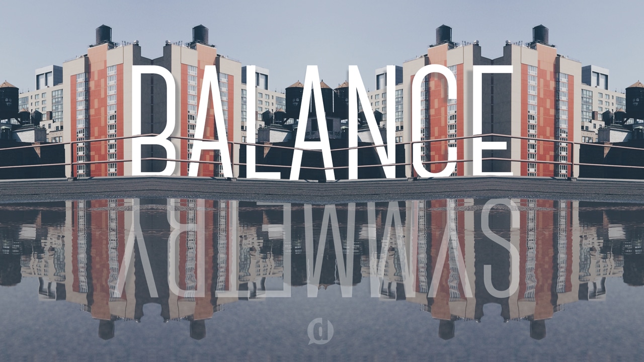
Example:

balance example on landscape middle

Okay, that one is pretty easy because the image is already perfectly symmetrical. So all you need to do is put your text in the center and call it a day.

But what happens if your background image isn’t perfectly symmetrical?

I’m glad you asked!

Asymmetry can be just as beautiful as symmetry as long as you balance it all out. Think of it like a set of scales. If the subject or focal point in the background photo are on the left side, then when you add your text you’ll want to put it on the right side.

balance demo bottom right

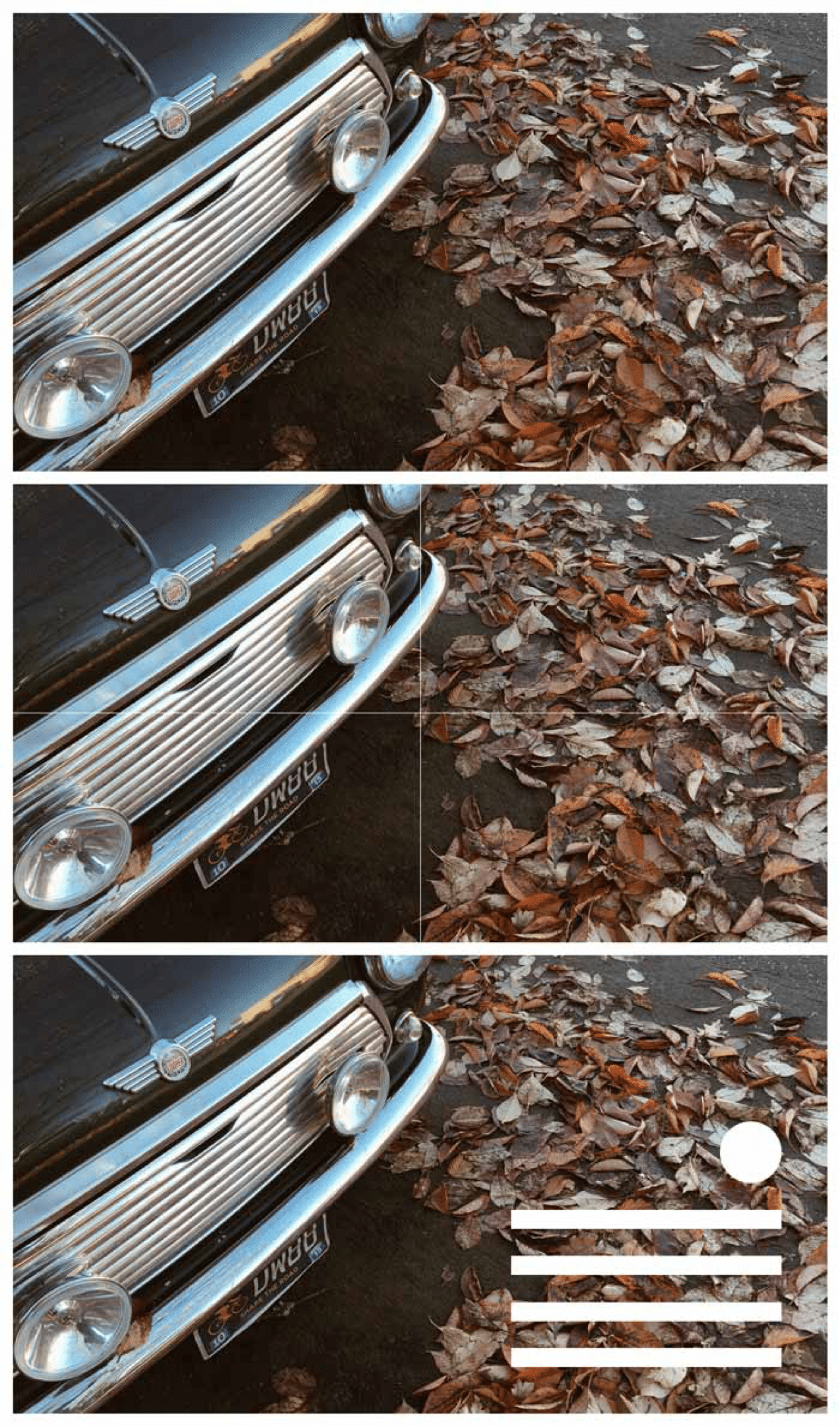
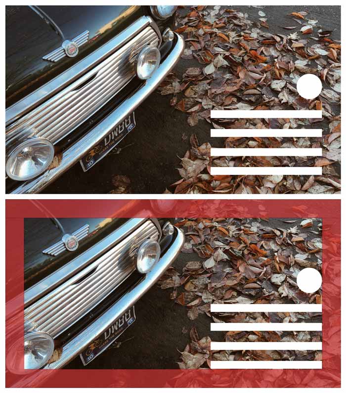
In the example above, you see that the car is the subject of this background photo. The subject covers the top-left portion of the image so to balance it out with our elements we put them in the bottom right.

Here’s a few more examples to help you get the hang of it:

balance demo square bottom right
balance demo vertical bottom left
balance demo square top left
balance demo vertical middle

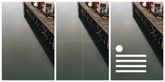
It doesn’t always have to be an exact science, but just remember to try and maintain the illusion of visual balance.

If the image isn’t balanced it can give the impression of instability making the on-looker feel like something is wrong. If you’re trying to evoke a feeling of instability or something similar, then go ahead and throw balance out the window.

But if you want your image to communicate beautifully, create visual balance between the photo/background and the text/logo elements.

[clickToTweet tweet=”#VisualContent #ProTip: Create visual balance between background & text elements.” quote=”#VisualContent #ProTip: Create visual balance between background & text elements.”]

Make sense? Good, let’s move on.

Framing the Photo

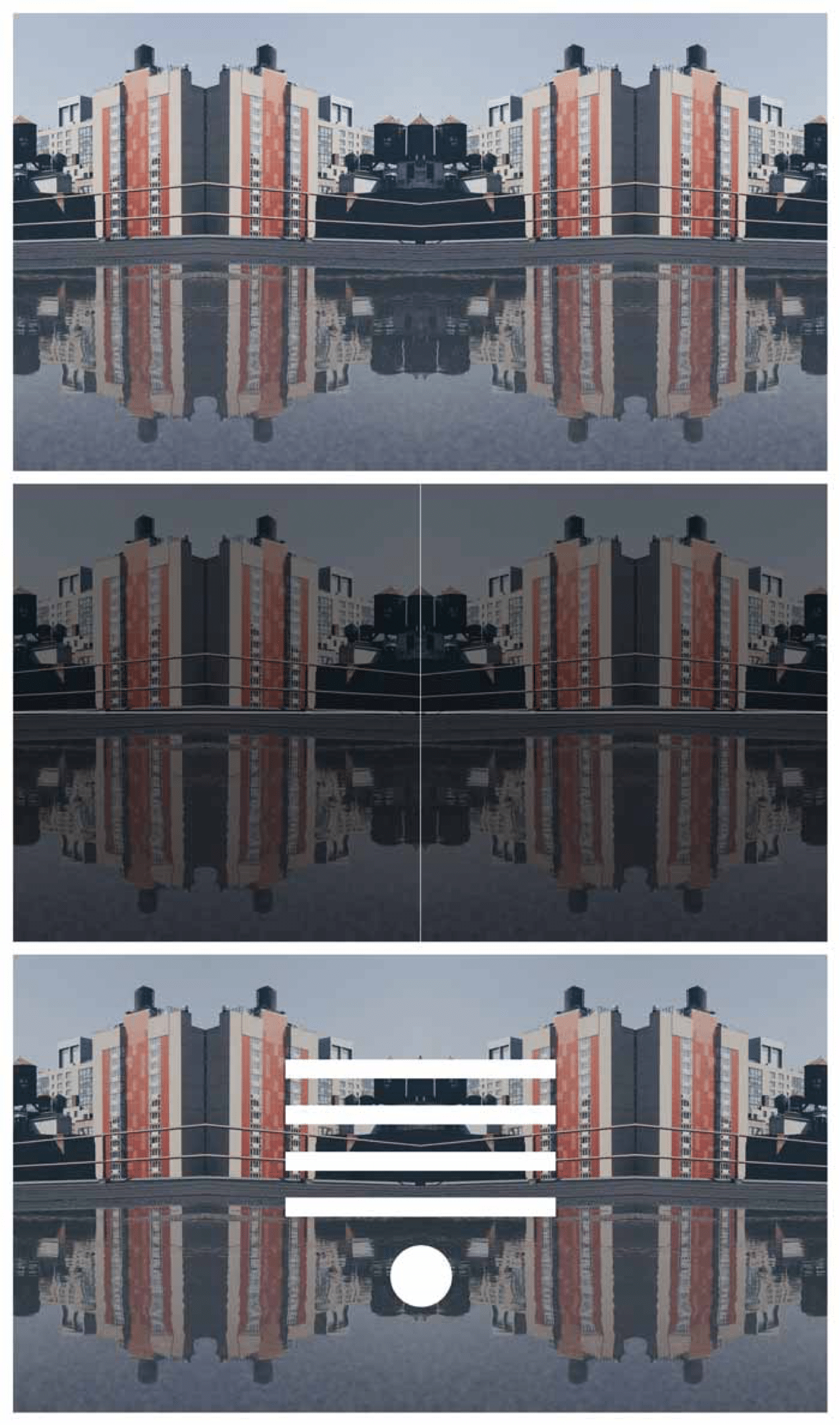
What I call framing is essentially creating an invisible frame around the outer most part of your image in which no elements are touching. Think of this as your non-negotiable white-space.

framing demo square

In the image above I’ve made my framing area red so you can see how I’ve applied it to the templates you’ve already seen.

Framing is especially important when you’re placing elements close to the edge of an image. If everything is in the middle you usually don’t need to worry.

In order to process imagery, our brain immediately looks for structure— something we can grasp on to. If our brains can instantaneously identify the structure we can interpret what we’re seeing quicker and with more ease.

This also ties back into balance.

Consistent spacing of elements (or in other words, framing) displays a set structure.

framing demo landscape

Notice how when you first see the image without the frame, your brain has already identified where the frame is.

When you place text or watermarks too close to the edge (or right against the edge) of an image it feels constricting. For people who are claustrophobic (or overly OCD designers like myself), it can cause tension.

When the framing is inconsistent it can also throw off the balance which takes us back to square one.

[clickToTweet tweet=”#VisualContent #ProTip: Frame your images & text, giving clear, consistent spacing for all text elements.” quote=”#VisualContent #ProTip: Frame your images and text, giving clear-cut and consistent spacing for all text elements.”]

If you’ve already downloaded my social media image templates then you’ll notice I’ve included the guidelines for the framing area for you. You’re welcome. 😉

Contrast is Key

Contrast is probably the hardest concept to explain. So let me start with a visual:

example of bad contrast

Contrast is most easily explained as the difference between two or more things. When it comes to visuals, we’re talking about the visual distinction between the background and the subject matter. The closer the two elements are to blending in, the lower the contrast. The lower the contrast, the harder they are to distinguish.

In the context of visual content and social media images your goal is to communicate a message. If that message is difficult to read, you’re shooting yourself in the foot.

edgar degas quote

When working with photo backgrounds though, it can sometimes be easy to accidentally position your text in a way that makes it difficult to read.

difficult to read image

Before finalizing your images always be sure that they’re fully readable. You may need to play with the text color a bit or even move the text around to ensure it doesn’t disappear into the background.

example of good contrast

[clickToTweet tweet=”#VisualContent #ProTip: Make sure your message has enough contrast to be clearly understood without eye strain.” quote=”#VisualContent #ProTip: Make sure your message has enough contrast to be clearly understood without eye strain.”]

Bonus tip: One of the easiest ways to create good contrast is to add a semi-transparent layer of black (or any dark color) between the background image and text.

Conclusion

If you manage to create an image with balance, framing and good contrast then your message will not only be effective, but beautiful as well.

As always, practice makes perfect so give it a go. Have some fun. Use one of my recommended mobile apps for visual content or one of the desktop apps that I’ve recommended as well.

In the comments below, share some visual content pieces you’ve created! You can leave a comment by clicking here.

Dustin W. Stout Avatar

49 responses to “How to Make Visual Content That Doesn’t Suck: 3 Easy Principles”

  1. wemi Avatar

    Visual content is more important than ever for igniting engagement; you should start creating and sharing it ASAP. Don t have any images? Make them. This is especially good for businesses who offer a service rather than a physical product, and may not have much to show in the photo department.

  2. Dustin W. Stout Avatar

    You’re very welcome!

  3. Adaeze Avatar
    Adaeze

    Thanks for making this post and sharing of this knowledge

  4. Dustin W. Stout Avatar

    You’re welcome, Mike!

  5. Mike Jackson Avatar

    This is a great post about visual content design. I love your post so much and many many thanks for sharing with us.

  6. Dustin W. Stout Avatar

    Gah! Thank you! I recently changed up the title for some SEO split-testing and didn’t catch that.

  7. Kim Avatar

    D’oh! There’s a typo in your opening header graphic. Flip the c and the i in Principles. 😀
    Nice content. Thank you!

  8. Dustin W. Stout Avatar

    What I’m mostly talking about here is visuals that have text and/or CTA elements. And these principles are the basis for good visual design, regardless of whether it’s casual or not. So if you’re just posting a plain image, then I guess these rules wouldn’t apply.

  9. Cat Avatar
    Cat

    Hi Dustin,
    This is great, thank you! I was just wondering if you think that pictures included in a more casual piece like a blog e.g., should follow these rules as well. I’m just starting to get serious about creating mine and I also love photography and would probably use mostly my own images, but nevertheless, I don’t know if you think it calls for it. Thanks for your advice! Cat

  10. Dustin W. Stout Avatar

    Glad you liked it Harry! What are you working on where you’ll be applying these principles?

  11. Harry Avatar

    Great tips Dustin, It’s like magic mantra for visual & graphic designers. You have explained “Balance, Framing and Contrast” is super cool way with perfect example. The people with artistic background certainly have ideas of all these techniques, but for a designer, who doesn’t have any art background will be benefitted from your post. Thanks a lot. Keep it up.

  12. Dustin W. Stout Avatar

    You’re welcome Dawn! 😀

  13. Dawn Metcalf Avatar

    Thanks for sharing these simple but important aspects of design in a way that most anyone can understand!

  14. Dustin W. Stout Avatar

    Haha! I’m so glad you found it useful Shameika! 😀

  15. Shameika Avatar
    Shameika

    Thank you for this, especially that tip of a semi-transparent dark layer!

    I have started as a digital marketing manager with a small start up, and am expected to use my knowledge from college and I alone am the entire marketing department, so there is plenty of pressure. This has helped a lot! Thanks!

  16. Dustin W. Stout Avatar

    You’re welcome Donato!

  17. Donato Esparrago Avatar

    Thank you for sharing your knowledge.

  18. Dustin W. Stout Avatar

    Awesome Ina! You may want to check out my post on Choosing Your Brand Colors. I haven’t yet written a post about logo design, but I have a loose idea drafted for it.

  19. Ina Avatar

    Great tips Dustin! This is going to help me out so much since I’m still trying to create a logo for my blog Chictales.com.

  20. Sylvia Avatar
    Sylvia

    Awesome! Very Helpful and clear!
    Bravo

    Sylvia

  21. Brown Avatar
    Brown

    Thanks Dustin for your help. You cleared that up for me.

  22. Dustin W. Stout Avatar

    I think that works great Brown! Shapes are a great way to frame the text to further separate it from the background.

  23. Brown Avatar
    Brown

    Bookmarked this post. I struggle sometimes with balance so your tip on breaking up the image really helps.
    In the hangout, you talked about if the text is still hard to see on the image, to use a brown or black semi-transparent layer over an image then add the text over it. I sometimes use a semi-transparent shape over the background which doesn’t cover the whole image. Wha’s your opinion? Should the transparent layer be over the entire image so it wouldn’t be distracting to the eye?
    Here’s an example of mine:
    https://www.canva.com/design/DABHvv0nP3c/Uhbzqimpopz-OYiwsBeGxw/view?&utm_content=DABHvv0nP3c&utm_campaign=designshare&utm_medium=link&utm_source=sharebutton&cc_from_uid=UABCXaLTt8I

  24. Dustin W. Stout Avatar

    I’m so glad you found it useful Rob! Rock on!

  25. Rob Newman Avatar
    Rob Newman

    I agree, Krista. For someone who is artistic these tips are probably instinctive. I also found Dustin’s post helpful. I’m analytic and a nerd. ha!

    These tips will help when I’m putting text or a logo on an image.

    Thanks Dustin, you did a good job of communicating artistic concepts with practical tips.

    Cheers,
    Rob

  26. Steve Chavis Avatar
    Steve Chavis

    Thanks for the tip!

  27. Dustin W. Stout Avatar

    Thanks for commenting Steve! My first thought– I would miss it if I weren’t looking for it. When I did find it, I couldn’t read it because the contrast is too low and the letters are too squished together. Make the text white and see if that works better. If you look at the street area around the text, everything else painted on the ground is painted in white anyways, so it makes more sense.

  28. Steve Chavis Avatar
    Steve Chavis

    Dustin, this may be beyond the scope of your great article and I’m no designer, but I have been playing with perspective and using GIMP to create some designs. On this particular image, i attempted to make the text look like it was painted on the street. What is your opinion of it?
    https://drive.google.com/file/d/0BzQtWsEoS9RFcjlPRms3MExSWVE/view?usp=sharing

  29. Dustin W. Stout Avatar

    Absolutely right Ty! I will sometimes (time allowing) run images through this color blindness simulator. Do you use anything similar?

  30. Ty Cahill Avatar

    Very good information!

    Regarding contrast, the white text on a red background has very good contrast, but black/white still provides the *best* contrast. Some people with color blindness will see the red more as brown. We can’t forget the people who have trouble seeing color.

  31. Dustin W. Stout Avatar

    My pleasure Elene! 😀

  32. Elene Marsden Avatar
    Elene Marsden

    I loved your section on balance-it made so much sense to me and will influence my “creations” in future. Thanks so much.

  33. Dustin W. Stout Avatar

    Really great slideshare Laura! Loved it!

  34. Laura Avatar

    Thanks for the tutorial on balance, image and framing (found it through MaAnna Stephenson’s BlogAid mention). My best example of trying to do all 3 of those is this Slideshare I created last year (my first of many now) which put text on quite a few images. The framing and balance was sometimes a challenge! http://www.slideshare.net/WarrenBerger/questolutionsa-way-to-make-your-resolutions-stick

  35. mohammad umair Avatar
    mohammad umair

    Yes Dustin. I have gone through almost entire “Creativity” section of your site. You create wonderful content.

    Thanks.

  36. Dustin W. Stout Avatar

    Thank you Renee! So glad you liked it!

  37. Dustin W. Stout Avatar

    Thank you Sam!

  38. Renee Avatar
    Renee

    Great tips and very easy to read Dustin. The visuals are great!

  39. Dustin W. Stout Avatar

    Awesome Greg! Glad this was helpful for you!

  40. Greg Savage Avatar
    Greg Savage

    Hi Dustin,

    thanks for this post, it’s really put a lot into perspective for me. Can’t wait to read more on this topic. This is where I struggle most.

  41. Sam Kneller Avatar
    Sam Kneller

    Simple and efficient with illustrative examples. Way to go. Merci.

  42. Dustin W. Stout Avatar

    I’m glad you liked it Mohammad! You may also like to read my Best Places to Find Free Images & Photos Online post if you haven’t already read it.

  43. Mohammad umair Avatar
    Mohammad umair

    I’m a content marketer and usually need images for blog posts which mostly include those taken from the net.

    This is more than a handy guide to not only work with the existing photos but create original ones too.

    Thank you Dustin

  44. Dustin W. Stout Avatar

    Awesome Soumya! Growing up in a small town, I have a lot of respect for small town entrepreneurs. Always keep learning my friend!

    And I think creativity can be taught, but it’s much easier to be grown like a muscle. Practicing and practicing.

  45. Soumya Roy Avatar

    Very helpful tips Dustin. I am a small city entrepreneur and you know, being a bootstrapped entrepreneur, it is not always possible to go to a designer. I learned web designing using internet but as we all know creativity can’t be taught and I seriously lack on that part.
    Your tips and shared resource will always be a great help for me and will follow these three rules of great visual designs. 🙂
    Thanks for sharing.

  46. Dustin W. Stout Avatar

    Haha Krista! I don’t know if all designers use those terms, but they’re definitely the ones I use because they seem to make sense to those I try to explain them to.

    I’m so glad you found it helpful! I intentionally crafted this post so that it was both easy and actionable.

    You’re absolutely right about the instinctual aspect. For a professional artist or designer, these things are common sense and usually taken for granted. But to be able to articulate these fundamentals to clients or students is an essential part of a designer’s skillset. Most designers though, since they take this stuff for granted, can’t properly articulate them.

  47. Krista Wiltbank Avatar
    Krista Wiltbank

    So those are the terms you designers use. I’ll mentally file those away to make me sound smart to my designer co-workers. 🙂

    Seriously, this is really helpful information. A lot of what you describe is almost instinctual – someone with a decent eye will be able to grasp the concepts even without having words to describe why they’re making certain design decisions – but it’s really great to have the terms defined and described for the non-designers.

    I’m definitely adding you to my must-read list!

  48. Dustin W. Stout Avatar

    Thanks Jeff! And you’re absolutely right– videography, photography, and graphic design have a lot of crossover when it comes to fundamental principles.

  49. Jeff Sieh Avatar

    Great tips Dustin! A lot of these tips can apply to producing great video as well. Definitely bookmarking this one!

Leave a Reply