There are three aspects to creating a reading experience on your blog that your readers will love. That’s it, three.
It’s one thing to create great content for your blog, it’s an entirely different thing to create a reading experience that keeps people coming back for more. Building a blog starts with great content, but if your readers are not given an enjoyable reading experience then you’re doing your content and your readers a disservice.
There are 3 factors that make up the reading experience on your blog. Typography, white space, and sizing. If all of these factors are working in harmony, your readers will love reading your content all the more. So let’s break it down bite-by-bite!
This is part of the Blog Design Essentials series. Be sure to catch the rest of the posts in this series to take your blog design to the next level!
Also, be sure you sign up for my Insiders list below to get the latest resources and advice for making this stuff easier for you.
Typography
Starting with the fonts you use, simplicity is key, but don’t be afraid to be unique. Your goal should be to have no more than 3 different fonts throughout your design. Each font should be assigned to one of three purposes. One font for Headlines, one font for Quotes, and one font for everything else.
1. Headline Font
This will be used only for the headlines and sub-headings for your blog posts and pages. Find a font that is bold, easy to read, and eye-catching.
The font I use throughout my site is called Open Sans and I use it for both headlines and paragraph font (which I’ll talk about next). Although they are the same font, you’ll notice that the headlines are always either bolder or darker making them feel more important. This is the first part of establishing a visual heirarchy.
2. Paragraph Font
Since your paragraph font will be the dominant font on your site, this is the most important of them all. Take careful consideration in choosing which font will be the dominant typeface throughout your blog.
If you were around for my 2013 new design unveiling then you saw how I totally botched this one! Live and learn– then teach what you learned so others can avoid the same mistakes!
The safest way to go is to select something that is commonly used– a web standard font. These include:
Serif fonts
- Georgia
- Palatino Linotype / Book Antiqua
- Times New Roman
Sans-serif fonts
- Arial
- Helvetica
- Comic Sans MS
- Impact / Charcoal
- Lucida Sans Unicode / Lucida Grande
- Tahoma / Geneva
- Trebuchet MS
- Verdana
Monospace fonts
- Courier
- Lucida Console / Monaco
Whichever one you choose, the goal is optimum readability. Since people will spend the majority of their time reading this font, it should be the easiest to read of all your fonts.
After my little font mishap, I decided to go with the designer favorite, Helvetica. However, I added a little spice to it by using a lesser known trick that calls out an even prettier Helvetica, Helvetica Neue. Most computers will render this prettier version, however some will instead revert to standard Helvetica.
As earlier stated though, my current design now uses Open Sans font throughout the site.
3. Quote Font
I also like to incorporate a different font for quotes. I just think it helps make them stand out from the rest of the text, giving the reader a visual distinction between your words, and the words of someone you are quoting.
Historically I’ve used a sans-serif font for all paragraph and headline text and for any quotes I would use a serif font. My go-to serif font of choice is usually Georgia. Not just because there is a song written after it, I simply just love the way it reads!
Currently the font I use for quotes is called Playfair Display and seems to work beautifully.
Finding the right font
If you’re not satisfied with the standard web safe fonts, I suggest using Google Web Fonts (like you see I have). There is a huge selection of great fonts and once you pick them out, there is instructions on how to implement them.
Use caution though, because not all of the fonts are cross-browser or cross-OS compatible (learned that the hard way). Be sure you test them on all browsers and both Windows and Mac machines.
White space
One of the biggest mistakes I see in web design is a lack of whitespace. Some people feel the need to fill the screen with as much as humanly possible or else their readers will miss something. This is a mistake.

This fits right into my simplicity philosophy, which I hope to share soon. Until then, I’ll just say that the less crowded your content is, the more your readers will be able to focus on it. Give plenty of breathing room.
For example, I’ve given lots of space on the left and right of paragraph text. I’ve also allowed for a good amount before and after paragraphs. Plenty of breathing room.
Take a deep breath. Doesn’t that feel good?
Sizing
The last piece is to decide on font sizes and line spacing. Did you know that there is actually a such thing as ‘Optimal Characters Per Line‘? Well there is!
Various studies have shown that the optimal characters per line is between 50 to 75.
To articulate this concept further, the Baymard Institute says it this way:
Too long – if a line of text is too long the visitor’s eye will have a hard time focusing on the text. This is because the length makes it difficult to get an idea of where the line starts and ends. Furthermore it can be difficult to continue from the correct line in large blocks of text.
Too short – if a line is too short the eye will have to travel back too often, breaking the reader’s rhythm. Too short lines also tend to stress people, making them begin on the next line before finishing the current one (hence skipping potentially important words).
A post by Mikey Anderson really convinced me of this. If you don’t know who he is, he’s the guy responsible for the beautiful design of theResurgence.com and PastorMark.tv as well as many others. He’s a truly brilliant web designer and I hope to be half as cool as him some day. You can read his thoughts on optimal characters per line here.
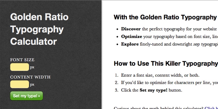
To help you find the optimum characters per line, I’ve discovered this gem of a web app developed by Chris Pearson. He calls it the Golden Ratio Calculator. It is an essential tool in finding your perfect font size and line spacing.

With my font and white space determined, I decided that the optimum size for me was a size 24 font with 34px for line-height for good line rhythm.
If you incorporate all of these principles, you will undoubtedly have created a stunning reading experience that people will always return to.
If you want a dead-simple and super fast way to give your blog a stunning makeover, I recommend starting with a theme from Studio Press [affiliate link]. Their themes are what I use to build all my web properties.
Where have you seen these principles executed or not executed well?

Leave a Reply
You must be logged in to post a comment.