2024 Social Media Logos: 21 Most Popular Social Networks [Free Download]

social media logos feature image

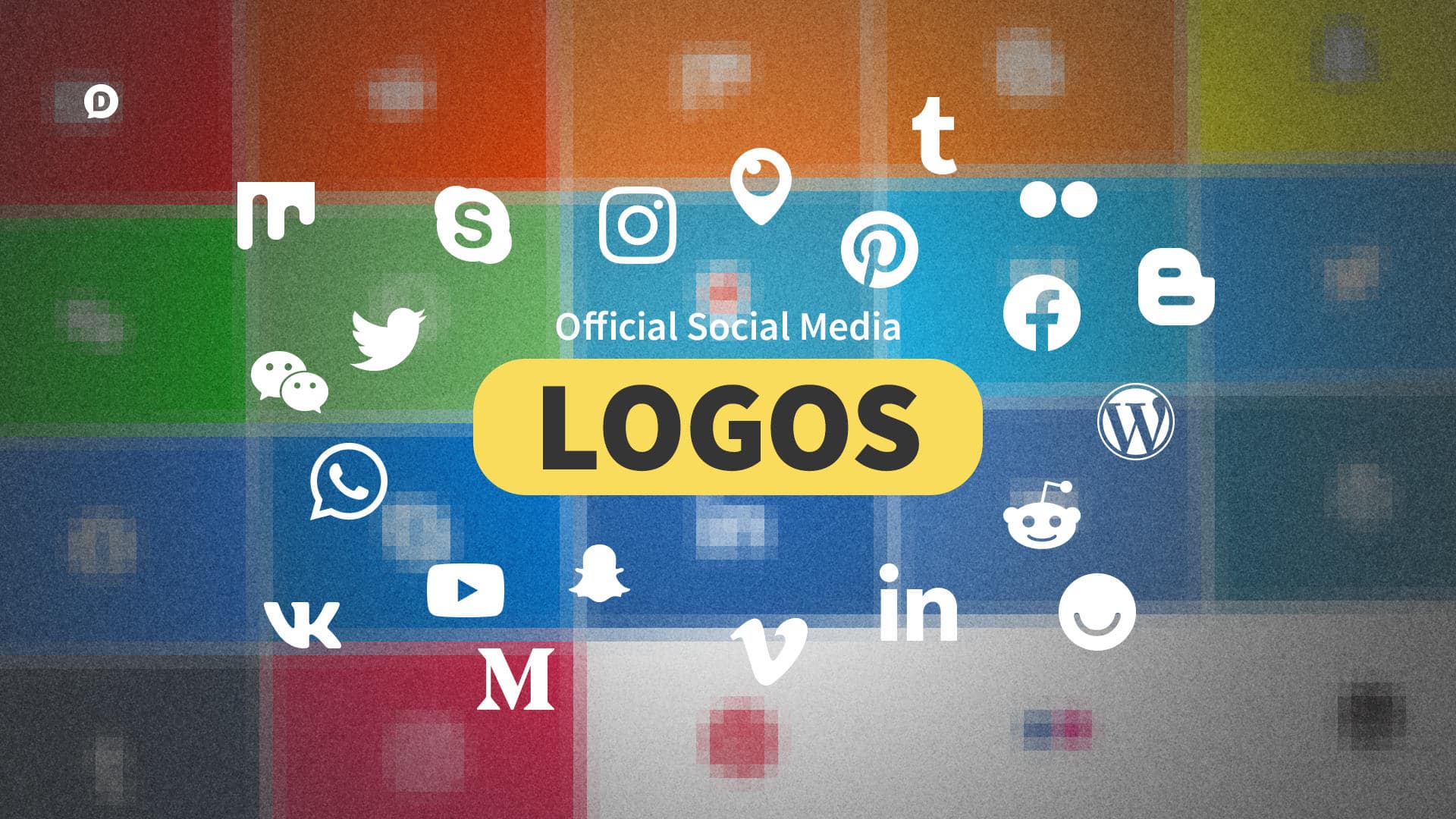
An always-updated, one-stop free resource for the most current social media logos of the most popular social networks. And the best part is these minimalistic social icons are all free.

As social networks grow from bootstrapped tech start-ups to a thriving social platform, they’re bound to undergo some logo changes. I have a particular sensitivity to when these social media logos change because branding is one of the things I do for a living.

When I see someone use a social media logo that is out-dated, or worse— a cheap knock-off of an official logo, it bothers me. It not only hurts my eyes, but it also gives the impression that the individual using it either doesn’t know better (they’re not paying attention to what they’re talking about) or they don’t know the importance of using credible visuals.

For the average person, keeping up with these social media platforms’ changes can be impossible.

So as a public service, I’ve decided to keep an updated list of the top social networks logos along with some visual assets that you can freely use to your heart’s content with no restrictions for personal or commercial use.

Just here for the free downloadable goods? Skip to the download

Why Care About Accurate Social Media Logos?

You may have seen my free Social Media Icons set that was created for a similar purpose. It’s a hand-crafted set of flat design JPG and PNG icons with solid and transparent background. That set is actually the basis for my social share icons.

But really it’s more than just an obsessive personal preference.

First, let’s talk about why it most benefits you to use the most up-to-date versions of social media logos.

Accuracy = Credibility

When people visit your website, they’re visually analyzing their experience whether they realize it or not. They’re looking for visual queues to tell them whether or not you’re trustworthy enough for them to stick around.

Having out-dated graphics can communicate that:

  • You are out of touch with or not savvy enough to know what is current
  • You don’t know what you’re talking about

These have negative effects on your credibility and act as a psychological repellant to your visitors. It might be an unconscious response as the viewer to not even realize why he/she thinks your site or whatever they see pertaining to you is not credible.

We tend to make millisecond responses to things without even realizing why we don’t like something. Digging in deeper helps us to realize that these little things play a HUGE role in viewer response toward credibility.

I have spoken at SMX East and West about this very topic of Visual Trust Indicators. And while this is but a small part of communicating trustworthiness, it’s also a very easy thing to fix.

Because… Branding

These companies spend hundreds of thousands of dollars on branding. They pay a graphic designer (or team of designers) like myself to craft their visual identity so that it will be consistent and recognizable.

Believe it or not, icon design is an artform in and of itself.

Also, each social media network creates guidelines which dictate what is allowed and what is not allowed in regards to their brand icons. It’s a lot of work building a brand identity. So out of respect (and legal compliance) for the brands themselves, I have resolved to represent the respective companies as they so desire.

This makes sure that I’m both in compliance with them (just in case they see what I do with their brand) and also gives the graphics that I create and share the look of authority and “know how” that has gotten me very far.

Most Popular Social Media Logos

Over the years, social networks have undergone a lot of changes–especially in the branding department.

The following are social sites are the most popular, and therefore the most susceptible to misrepresentation. To save you from getting caught with an outdated or completely wrong logo, here are the official logos of the most popular social platforms.

Official Facebook Logo

facebook logo icon

The newest Facebook logo (which is being slowly rolled out) is simply the trademark ‘f’ centered inside a circle. There’s no more square, no more offset for the ‘f’, and the new blue color is brighter.

This new Facebook icon hasn’t gathered much attention as of the time of this post, but as they begin to roll it out in places other than their brand guide, I’m sure it will gain some mainstream attention.

For now, consider yourself one of the first people to know about it!

facebook wrong logos vs correct

Facebook has stayed pretty consistent with their logo over the years, and all changes have been subtle enough as to not draw much attention.

However, over the past year, there have been more dramatic changes, especially to it’s wordmark. The change sparked a lot of debate in the design and branding community, but most average users didn’t even notice.

facebook full logo wordmark

See if you can spot the difference:

facebook old logo wordmark vs new logo wordmark

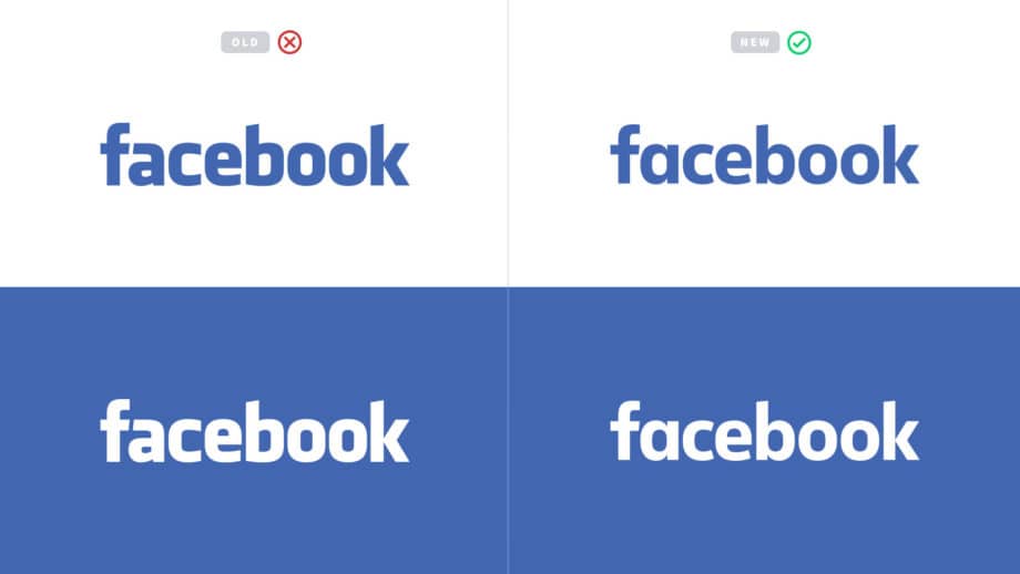
The changes are subtle, but I think I understand why the choices were made. For one, the new word mark is softer, less “techy” looking with rounder curves. It’s a bit lighter in its weight, and feels more friendly than the previous wordmark.

Official Instagram Logo

instagram official logo

Over the years the Instagram logo has continued to get simpler. It started as an iOS-only app and the icon was meant to match Apples then skeuomorphic design. When apple switched to the flat design trend, Instagram soon followed suit.

With the continued design trend of simple, minimalistic icons, Instagram again changed their logo to what we see it as today.

instagram logo changes over time

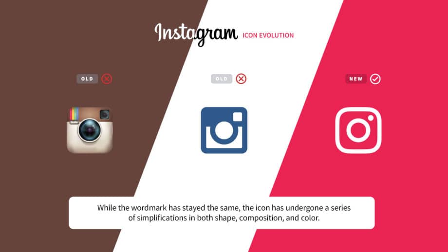
While the Instagram word mark has remained pretty much identical–apart from color–the icon’s current iteration is about as simple as you could possibly get.

Official Twitter Logo

official twitter logo icon

The most frequent victim of visual confusion is the Twitter logo. Whether it’s a TV show advertising its social profiles, or a business asking people to follow them online, Twitter icons seem to be all over the place as far as accuracy.

It’s partially Twitter’s fault since they’ve undergone so many icon changes over the years and people just can’t seem to keep up.

incorrect twitter logos vs official twitter logo

Their current official logo is the bird with its head angled up. It’s a brilliantly crafted icon and deserves to be represented properly. So for the love of all things holy, stop using that ridiculous lower-case ‘t’ icon.

Official YouTube Logo

official youtube logo in full

How many people can remember when YouTube first started? The internet was a completely different place, wasn’t it?

Since its inception, YouTube’s logo has undergone only a handful of changes, and mostly very subtle. It wasn’t until recently that a major rebranding happened, giving the video-centric platform a very modern logo.

old youtube logo vs new youtube logo

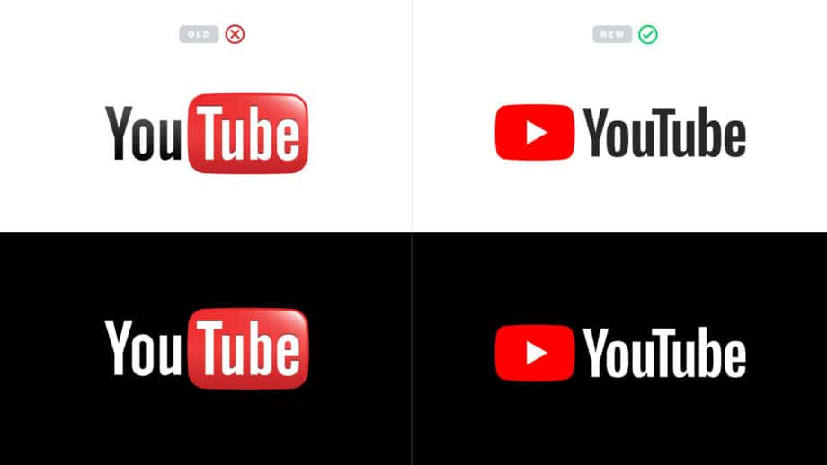
Both the full version and its icon are used throughout its various apps and properties, unlike Twitter, Instagram, and Pinterest who primarily focus on their icon.

youtube logo icon

What I really love about the YouTube icon is how utilitarian it is–it’s the play button that appears on every video you watch. Brilliant use of repetition so that brand recognition is easy.

Official Pinterest Logo

official pinterest logo icon

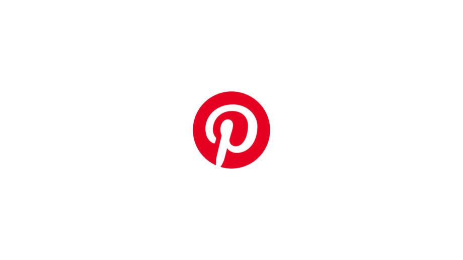
Oh, Pinterest, how I love thee.

The Pinterest icon has remained the same since its inception over 12 years ago. And what a delight that is for many a designer.

Now, to the eagle-eyed onlooker, you may have noticed that the color of red has changed slightly over the years. The most current red in their branding is as bright as it’s ever been, following the same bright color trend that other networks such as Facebook, Instagram, LinkedIn, and YouTube have employed.

Other than that, though, the Pinterest icon remains completely unchanged. And that makes my job so much easier.

Official LinkedIn Logo

official linkedin logo full

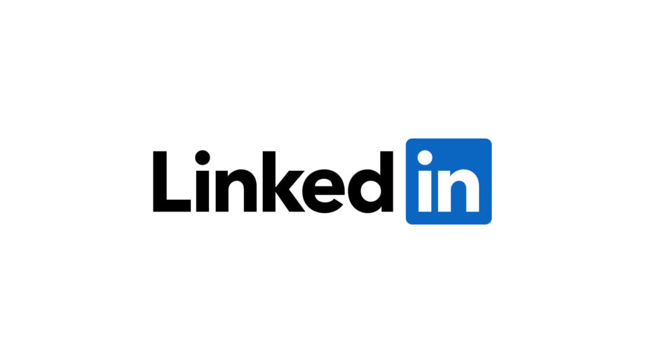
Much like Pinterest, LinkedIn has stayed pretty close to its brand roots with it’s primary logo. The only thing that has changed is the primary blue.

Much like the other networks, my guess is that brighter colors are aimed at targeting younger audiences, and giving the brand a more fresh or exciting feel. Younger people tend to be attracted to brighter colors, so this seems a smart move for all social media platforms.

LinkedIn also makes good use of it’s solitary icon logo when minimal space is available.

All Social Networks

For the sake of time (and energy) I’m not going to give a synopsis of every social media network’s brand logo history. So instead of droning on and on through all 21 networks, I’ve instead decided to just package up all the logos into one downloadable set.

Download All the Official Logos

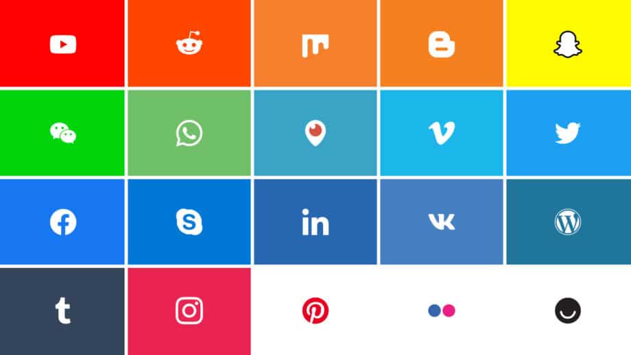
Simply click the download button below to download all the high-resolution official logos for the following social networks:

  • Facebook
  • Twitter
  • Instagram
  • LinkedIn
  • Pinterest
  • Snapchat
  • Reddit
  • YouTube
  • WhatsApp
  • Periscope
  • Vk
  • Skype
  • Vimeo
  • Flickr
  • Ello
  • Mix
  • WeChat
  • WordPress
  • Blogger
  • Tumblr
  • Medium

The package includes four styles of each social media network logo in high resolution JPG and PNG format. Styles includes:

  • Full color logo in JPG file format
  • Full color icon in transparent PNG file format
  • White icon in transparent PNG file format
  • Black icon in transparent PNG file format

If you’re a designer or work with professional grade design tools and want the vector versions of all the logos, I’ve got that for you as well.

Download the Vector Logos

Simply add your email below and click Download! You will get a confirmation email with all the vector icons in both PSD and AI format. That package also contains all JPEG and PNG files to save you the time of having to download both sets.

social media logo grid

Download All Social Media Logo Assets (JPG, PNG, PSD, & AI)

Just enter your email and the download link will be sent straight to your inbox! You’ll also be added to our email list and be the first to hear when new assets are available.

The PSD files contain smart objects for scalability (if you don’t want to open Illustrator). If you are an Adobe Illustrator user, the AI file contains all icon sets, sized at 32px if you want to use them to create your own cool icons.

Save them, add them to your social media icon collection, insert them into a great visual you’re creating for your next blog post, and share freely knowing you have the most official version of the brand logo represented.

Hope You Enjoy

I’ve done the hard work in rooting through the brand guidelines of each network to make sure all these logos included above are accurate and up to date. If you’d like to double-check for yourself (which I highly encourage you to do) here are the links to each network’s publicly visible guidelines:

Oh, and lastly–if you missed my reference above, I do have a free icon set made from these icons that are already pre-formatted at 32px. This makes it easy for you to use them in your blog or website as links to your social media profiles. Be sure to download those as well!

Are there any social networks that you’d like me to add to this list? You can leave a comment by clicking here.

Dustin W. Stout Avatar

112 responses to “2024 Social Media Logos: 21 Most Popular Social Networks [Free Download]”

  1. Thaddeus J Lee Avatar

    YOU HAVE MADE MY WORKLOAD AND CREDENTIALS GIGATONS LIGHTER! APPRECIATE IT PAL. CROSS PATHS, SOMETIME.

  2. Dustin W. Stout Avatar

    Oh, that’s great! Glad you found a great use for them!

  3. Rods Avatar
    Rods

    Hi, thank you so much for these…dowloadable logos. I am using these logos as an ice breaker and game before my actual lesson in communication. GBU😊

  4. john Avatar
    john

    great

  5. Dustin W. Stout Avatar

    Hope you get lots of use out of them, Gerri!

  6. Gerri Avatar
    Gerri

    Awesome – great article and I appreciate the ability to download the current logos.

  7. Bryon Hutcheson Avatar

    Thank you so much for these! and thank you for staying up-to-date. A lot of designers and blogs are not staying on-top of things when it comes to social media. Cheers!

  8. Dustin W. Stout Avatar

    Hi, Canelo! Could be a bug in your browser or internet connection. Give it another try in a new tab or browser to see if that works.

  9. Canelo Forum Avatar
    Canelo Forum

    Hey, I am so happy someone did this, this is exactly what I’m looking for! But the download link is not working for me. I put in my email but when I press the button it just says “Processing…” forever. I haven’t received any emails. Could it be a bug?

  10. Alyssa Avatar
    Alyssa

    Crazy, I didn’t even realize how much these logos had changed over the years until you pointed it out. I don’t even remember that oldest version of the Twitter bird at all!

  11. Dustin W. Stout Avatar

    Join the email list, and you’ll get a link. 😉

  12. Pablo Gainza Avatar
    Pablo Gainza

    Could you please send me a link to the vectors? 😉

  13. Dustin W. Stout Avatar

    It could be some sort of browser conflict or just a temporary glitch in the form submission. Just give it a try after walking away and coming back later.

  14. amanda Avatar
    amanda

    Hey, I am so happy someone did this, this is exactly what I’m looking for! But the download link is not working for me. I put in my email but when I press the button it just says “Processing…” forever. I haven’t received any emails. Could it be a bug?

  15. Dustin W. Stout Avatar

    You’re very welcome!

  16. arpitha Avatar
    arpitha

    Thank you for sharing those logos. from so many days I am looking for them.

  17. Dustin W. Stout Avatar

    Sorry to hear that Charly… only other things I can think of are:

    1. Internet connection
    2. Javascript blocking (stopping the form from being submitted via Ajax)
    3. Temporary server overload

    I am again able to complete the form and submit in 3 different browsers (without being logged in and without cookies).

  18. Charly Avatar
    Charly

    Well same here.. Same problem in three different browsers ..

  19. Dustin W. Stout Avatar

    Hi Jordan! Sorry to hear that. I was able to try the form again and successfully submit it. Maybe try switching your browser?

  20. Jordan Avatar
    Jordan

    Hello,
    I’ve been trying to access this icon set but the button continues to say processing without receiving any email. Please check on the form/link.

    Thank you

  21. Dustin W. Stout Avatar

    My “Insiders” get access to the vectors. 😉

  22. vectordude Avatar
    vectordude

    Any chance you could add Vector based logos in the download?

  23. Dustin W. Stout Avatar

    Glad you found it both useful and entertaining! Double win!

  24. Dustin W. Stout Avatar

    Glad you found it both useful and entertaining! Double win!

  25. Shea Avatar
    Shea

    You’re passion about this is entertaining. I was looking for which logo was a ‘W’ because according to a sketched out Maslow’s Heirarchy of Needs, WordPress satisfies our need for self-actualization.
    Thanks.
    SKK

  26. Dustin W. Stout Avatar

    Not that I could find. I did link to each network’s branding guidelines in the post, so you can double-check to make sure they haven’t changed that.

  27. Mark Avatar
    Mark

    Are the logos you offered for us to download need any licensing from you to use?

  28. Dustin W. Stout Avatar

    You’re very welcome!

  29. carrie Avatar
    carrie

    thanks for the updates!

  30. Dustin W. Stout Avatar

    That sounds like you’re talking about Tumblr’s logo.

  31. Paul Luiso Avatar
    Paul Luiso

    I’m seeing a free-standing white lowercase t on a rounded corner blue box. What is it?

  32. Dustin W. Stout Avatar

    Thanks Kim! I’ll add that to my list for consideration as I get ready to update this soon.

  33. Kim Avatar
    Kim

    I’m looking for the bitly icon vector format please

  34. Dustin W. Stout Avatar

    Hi Kim! Actually, those who subscribe to my Insiders Newsletter get access to the vector files.

  35. Kim Avatar

    Could you add vector files to your downloads of the most current icons? We need them in our printed materials and the web versions are low resolution, or let me know a great place to find them.
    Thanks!

  36. Wisnu Avatar

    Just to add the new social media that big in the Asia; Path & Steller. You might want to add their logo 😀

  37. Abby Avatar
    Abby

    Thank you so much!! this means a lot 🙂

  38. Dustin W. Stout Avatar

    Thanks Tara! Since Etsy doesn’t qualify as a Social Network, I don’t think it would be a fit for this collection.

  39. Tara Rodden Robinson Avatar
    Tara Rodden Robinson

    Hi Dustin,

    Thank you so much for all your work and super-kind generosity in sharing these! On your next go-round, would you consider adding the Etsy “E”?

    With gratitude,
    Tara

  40. BettiePageGaming Avatar
    BettiePageGaming

    I would love to see Twitch added to this list. Please 🙂

  41. Dustin W. Stout Avatar

    Glad you found it useful Brent! Thanks for stopping by!

  42. Brent Jones Avatar
    Brent Jones

    Hi Dustin!

    This is one of my favorite things about dropping by your blog each month… you’re always posting something of exceptional value.

    As you know, design isn’t my strong suit. But that said, I really have trouble understanding how basics like up-to-date social media icons get missed.

    That’s pretty basic stuff.

    “Anyone using the old black Google+ logo should be publicly flogged.”

    ^ That made me laugh.

    Nice job, Dustin. Have a great week,

    Brent

  43. Dustin W. Stout Avatar

    Snapchat is on the way. 😀

  44. @alexwyrick Avatar
    @alexwyrick

    Hi Dustin! Fantastic of you to share this resource… Some very valuable points on the power of branding.

    My only feedback is to add a Snapchat icon 🙂

    Thanks!

  45. Dustin W. Stout Avatar

    Happy to chat if you need help Ontario!

  46. Ontario Cruz Avatar
    Ontario Cruz

    Thts good stuff. Im.looking for help with my logo. It’s a roofing and construction company. Just starting. Difficult task,wouldn’t hv thought at first.

  47. Dustin W. Stout Avatar

    That has been added to my list. 😀

  48. James Sarino Avatar
    James Sarino

    Elaine, I mentioned it to him back in September (see my post above). I’m sure that channel has made enough traction to be worthy of an icon at this point. 🙂

    James

  49. Elaine Avatar
    Elaine

    its time for Blab too please.. You always have the best most currents icons!

    Love your work!
    Elaine

  50. Dustin W. Stout Avatar

    Glad you found it useful! 😀

  51. Iswadi Avatar
    Iswadi

    Thank’s so much for providing this resourceful post, Dustin.
    now i have the weapon to fill my company’s legal team requirements.

    Hi Chris,
    i thought you can just open a PDF vector based file to PSD at the size you required or just open in .ai as vector. CMIIW

  52. Dustin W. Stout Avatar

    Ah, great idea James!

  53. James Sarino Avatar

    What about Blab? Would like to see that one added to your icon list. 🙂 Awesome article, Dustin!

    James

  54. Dustin W. Stout Avatar

    I think you mean Meerkat. I’ll be adding it very soon. 😀

  55. Maureen Avatar
    Maureen

    I noticed a new company icon it’s in yellow and can’t find it anywhere saw it watching program and listed all the social media icons fb ect but the yellow one is a new one can’t see lettering in it hope I haven’t confused you thanks Maureen I’m just curious

  56. Ruth McAdams Avatar
    Ruth McAdams

    A TripAdvisor logo would be helpful.

  57. Dustin W. Stout Avatar

    Awesome Deb! You may also want to take a look at my Social Media Icon Set.

  58. Deb Avatar
    Deb

    Thank you so much for this resource. I am redoing a client’s old website to optimize it for mobile and desktop, and the icons were out of date. I’d been searching for a couple of days when I came across a reference to your blog on another site. Your logos were exactly what I needed. Thank you!!!

  59. Dustin W. Stout Avatar

    Yes, I actually said that in the 3rd paragraph– this will be a constantly updated resource. Just like I have resolved to update my Social Icon Set and my Social Media Cover Photo Templates I have resolved that whenever there is an update to an official logo, I will update this resource. It’s as much for my benefit (because I can’t stand being outdated) as it is for my readers, and particularly my Insiders.

  60. Name Avatar
    Name

    oh. and yeah, this is really great that you put all the latest logos together. Sometimes it’s just a pain to go through every social media website digging for their official logos.

  61. Name Avatar
    Name

    Have a question. This article is going to be out-of-date at some point with all the logos being published here. How are you going to proceed with updating the logos? Are you going to update the article? It would be awesome if someone could come up with some sort of permanent source where all the latest social logos could be stored and updated as they get updated officially.

  62. Dustin W. Stout Avatar

    Hi Ann! It seems when I did some rearranging I moved the folder. I’ve changed the link to now download the .zip file directly! Thanks for the heads-up!

  63. ann perri Avatar
    ann perri

    Thanks for the blog – I clicked download but seems folder is empty now – happen to have a new location? Thanks – AP

  64. Dustin W. Stout Avatar

    I don’t know where you read that Jacob, but WordPress does not charge for making changes. There are theme’s that you can buy, but there are a whole lot of free themes as well.

  65. jacob Avatar
    jacob

    I noticed that WordPress charges a fee for you to make changes to your blog and blogspot doesn’t..But does wordpress have some other advantage over google’s blogspot that I’m missing?.

  66. Amy Miller Avatar
    Amy Miller

    Thanks for doing all the leg work!

  67. Joseph McLean Avatar
    Joseph McLean

    THANK YOU! At last someone who understands! You’ve made my day.

  68. Dustin W. Stout Avatar

    Thanks for adding to the conversation Angelique! But tell me this– let’s say you own an Apple computer and it breaks down. The first website you land on says “We fix Apple computers!” and it has a graphic from the 1980’s.

    How likely are you to trust that they are capable of fixing your modern day Apple computer if their messaging involves something outdated?

    Okay, that’s a bit of an extreme case, but the concept is still sound. Social media has brought about hyper-relevance mentality. If you’re a Twitter “expert” or promote yourself as such and you’re using the old “t” that hasn’t been around in 5 years– how relevant of an expert can you possibly be?

    LinkedIn isn’t an expert on Twitter– LinkedIn is an expert on LinkedIn which is why that offense is dumb, but not a deal-breaker.

  69. Angelique Avatar

    Hey Dustin
    Great perspective.
    I do disagree that it means people don’t know what they are talking about if they are using an old logo.

    People pay attention to details in different ways. That doesn’t mean they don’t have up-to-date knowledge to teach on the social media if they don’t use the correct logo (ahem, I do raise my hand to this).

    We all have our pet peeves – as a photographer I hate seeing a groom “passionately” kissing the bride yet his arm is hanging down by his side; and I hate to see people infringing copyright by screencapturing images from viral posts and sharing on their own social networks hoping to catch the likes/shares themselves; I notice typos a lot in blog posts (yet I find myself making spelling errors on words I KNOW how to spell).

    Funny enough, I read your post today, and then checked LinkedIn. I noticed the new “publish” option for a status update, with some help pop-up boxes. And there at the bottom of the LinkedIn blog-type panel beside the “publish” button is….the chubby 2012 Twitter icon with his little tuft of feathers on his head!

    {I wish I could share a screenshot!}

    Surprising due to LinkedIn’s relationship with Twitter.

  70. Dustin W. Stout Avatar

    lol I’m honored that you would take the time to stalk me Julie. 😀

    And I really did love your post! Those tips are super helpful for all bloggers – not just newbies!

  71. Julie Chenell DeNeen Avatar
    Julie Chenell DeNeen

    So, just me – stalking your website after your icon-atastrophe comment on my graphic. LOL So I just went through and updated it, then I came here and realized – I STILL HAVE THE WRONG G+ graphic in my post now. GRRRR. LOL In my defense, I spend a TON of time on Google plus, I just simply don’t pay attention to the favicon at the top. Anyway, I’m tired and it’s late so I’ll stop rambling on here. 🙂 Love your posts, and the principles…but I’m gonna have my black G+ graphic on my post for a few more days…you know, to harken back to more vintage times. It was simpler back then. 😛

  72. Dustin W. Stout Avatar

    Well, you’re certainly entitled to your opinion. Psychologically though, whether conscious or unconscious, people notice quality and it is linked to trust. As a real estate agent, you should know the importance of visual presentation in winning clients over. If a property looks tacky and is filled with outdated decor, how does that affect a buying decision? Your website is selling you. So if it’s riddled with outdated, inaccurate decor (or cheap knock-offs of social media logos) people notice and you’ve just greatly reduced your chances at landing a savvy buyer.

  73. Cleo Shahateet - Real Estate Agent Avatar

    Thanks Dustin for the article. I feel the change is not as important to the audience as you are saying and that in some cases the black logo may look better than the newer ones. I think that the main thing people look for is the “g” that everyone will recognize. I think there are way too many things to be concerned with than any of these icons.

  74. Dustin W. Stout Avatar

    Awesome Andrea! I’ll be sure to take Bloglovin into consideration for my next Social Icon Set update. 😀

  75. Andrea Avatar
    Andrea

    Thank you Dustin. I am working on a redoing my blog. I have pinned lot’s of “cute” icons, but after reading your article I am going with the official ones. I like the white. A bloglovin one would be nice too:)

  76. Krishna De Avatar
    Krishna De

    Thank you for creating this helpful resource – curated to Pinterest too so I can refer others to it!

  77. Dustin W. Stout Avatar

    That’s exactly why I created them! Glad you found it useful! 😀

  78. Lee Odden Avatar

    It’s funny how often I find myself looking for these, thanks Dustin.

  79. Dustin W. Stout Avatar

    Haha! I noticed that too Debi! Our little fighter is doing just fine. 🙂

  80. Debi Stangeland Avatar
    Debi Stangeland

    Happy New Year! I hope baby M is doing great. I was just working on my monthly newsletter and MailChimp is using out of date social buttons for users to insert into their emails and newsletters. Oy! I’m really noticing this now, everywhere. Thanks for the great info.

  81. Dustin W. Stout Avatar

    My pleasure Steve!

  82. Steve Wharton Avatar
    Steve Wharton

    Point taken, Dustin. Thanks again for the post!

  83. Dustin W. Stout Avatar

    Thanks Steve, but to be clear, this is less about the company and more about your reputation. See my reply to Chris.

    It’s the same as if I were to talk about “Gogle” as if I had authority and insight on them. Can you really take me seriously if I misspell their name like that? (Also see my comment to Erik.)

  84. Dustin W. Stout Avatar

    Exactly Chris. Or what about when someone calls you by the wrong name. Happens to me all the time– people call me Justin. The first one or two times can be excused. But if they claim to “know me” but continue to refer to me by an incorrect name people are going to have the impression that they’re either a complete imbicile or they really don’t know me at all.

  85. Steve Wharton Avatar
    Steve Wharton

    Dustin,

    Thanks for a very well-written, well composed, insightful, sincere, graphically-appealing* article– as usual!

    Please allow me to register my dissent from your post’s apparent, basic premise.

    This is kind of an awkward thing you propose, really. That we–the mere minions, aka the customers, aka the stakeholders–are somehow obligated (by sensible, current graphical and/or designer-correctness, or by any other implied obligation of any kind) to be supporting the efforts of the corporations and corporate billionaires for their sake???? Wow.

    Sorry to be so bold as to respectfully dissent in this time of the social-web replete with its *pseudo-genteel expectation of unilateral agreement, mutual-aggrandizement and mindlessly-congratulatory a$$-kissing, trolling, SEO-sheep, yes-men (wow…I’ll share how I really feel tomorrow!) …but, I believe you have it backwards, Sir.

    If a corporate logo has been changed three or more times in the ten-year existence of a corporation–that or any such business entity should expect multiple versions of their logos and branding to perpetuate in the market-wild.

    Successful companies serve their customers, their stakeholders, and their markets. Business earns the patronage, the respect, and resulting relationships with their customers, their stakeholders, and their markets. Not the other way around. Just saying.

    Thanks again for the insightful post. Got me riled up a bit, you did. (I’m over-it now. Happy New Year!)

    Cheers

  86. Chris Rouse Avatar

    I don’t really see a difference between using an incorrect name or mark. If it didn’t matter so much, companies would spend so much time discussing it. If you see one of these in the wild, please gun it down.”

    The brand mark of any company is part of their identity, just as much as the name of the company. It’s part of the reason companies like Apple (computers) and Apple (Beatles record label) sue each other over names, or why companies send cease and desist letters to companies with very similar (or even remotely similar) logos.

    Typing the name wrong could be something as simple as an honest typo. However, getting the name really wrong (mini Mac instead of Mac mini; iMac Pro instead of iMac or Mac Pro; Win8 instead of Windows 8) is, to me, exactly the same as intentionally (or not) using the wrong logo for a company. The company’s trademark or brand mark should be treated with the same respect as the written name of the company.

  87. Dustin W. Stout Avatar

    And thank you Skip for having the humility and confidence to be able to recognize it and make the change without getting defensive! That’s is true character!

  88. skipprichard1 Avatar
    skipprichard1

    Dustin, my comment was slightly delayed as I was getting flogged. Ouch!

    Thank you for bringing this up. I have the oldest logos, figuring “why bother” if everyone knows what they are anyway.

    But you made the point extremely well.

    Thanks.

  89. Rebekah Radice Avatar

    Great job Dustin! Downloaded, pinned and shared! You know how much I agree with you about the importance of consistent branding.

    It can be tough to keep up with all of the logo changes, even for someone looking at them every day! 🙂

  90. Mike Hale Avatar
    Mike Hale

    I still see plenty of sites (including those of social media marketing agencies) using the old Twitter “T” logo. It’s even worse when they have Tumblr (also a T) in the mix! Thanks for the handy graphic on what’s current, very helpful!

  91. Stuart Bruce Avatar
    Stuart Bruce

    Great post and resource pulling the logos together. Well done. Agree with you about importance of credible visuals as using the wrong ones gives an impression of carelessness or not knowing any better. But ‘getting it right’ is a general rule that applies to all communications so you might want to update your Google+ graphic to correct the typo as words matter just as much!

  92. Dustin W. Stout Avatar

    Thanks for taking the time to write such a thoughtful comment Angela!

    About the new YouTube logo– it’s a “Play” button. It’s the same button you’ve always seen on YouTube videos (and sort of universally as the play symbol). It makes a lot of sense to me.

    I really love how Pepsi and Coca-Cola have approached branding as well. They’ve done such a great job from the beginning that they haven’t needed to update drastically in decades. Although Pepsi did go through a bit of a change, but like you said, not drastic. 😀

  93. Dustin W. Stout Avatar

    Yea, Chris– I’m with you! Instagram (and even Facebook for that matter) really need to get their act together. I love that YouTube and Twitter are so intentional about their brand guidelines.

  94. Dustin W. Stout Avatar

    Thanks so much Brian!

  95. Dustin W. Stout Avatar

    Fair enough Jim! Content first– visuals second is what I recommend anyways (and I make my living on visuals! lol). Consider this though (as I said in another comment) what is the difference between a typo and an incorrect logo? Would love to hear your thoughts.

  96. Dustin W. Stout Avatar

    Awesome Fabian! Thanks, I’ll give it a look!

  97. Dustin W. Stout Avatar

    Yea, it’s not so much about how the company might feel (odds are, they’re not paying that much attention unless you’re a major news outlet). However think of it like this– what do you think when you see a typo in someone’s writing? A company name, misspelled, doesn’t show much savvy on the writer’s side and most writers are pretty deliberate about avoiding typos. A company name is simply a word. A word is simply a group of symbols (visuals) that help us to identify and interpret a thing. A logo is a solitary symbol that helps us visually identify a thing. What makes a written typo different than an incorrect logo? Would it be acceptable for me to speak of Gogle+ and claim to have insight on the company?

    Just something to ponder. I’ve yet to have anyone come up with a good response to the difference between a typo and incorrect symbol. Would love some good feedback!

  98. Angela McCall Avatar

    Hi Dustin,

    I just added you on my Google Plus. I have seen this post from one of my friends promoting it on facebook. Anyway, logo designs are one of my favorites! I’m still developing my logo. I want to stay away from “initials” like AM or something. I just want to create a logo that says about me, my personality, and a whole bit.

    Anyway, just to throw my 2 cents here, I don’t really like the new logo of YouTube. I like their old logo better. To me, their new logo is very confusing. And so what is that “arrow” mean to me? I just don’t understand it. Maybe I’m lacking of visual here. But I just don’t get it. On the other hand, I love the NEW Twitter logo than just that “t” one. I don’t really like the G+ new logo that much. I dunno something is missing there I just cannot pinpoint what it is but it needs something. Perhaps a different design. Facebook logo is okay. I like it when they stay on the SAME pattern, rather than changing it drastically. It just throws me off visually and “remembering” what logo belongs to who.

    Pepsi Cola, Coca Cola, Apple Computer…their logo doesn’t really change much other than the graphics or let’s just say the “treatment” of it changed. Pepsi Cola stick to 2-color all the time and that’s why I always remember them no matter how they flip their logo, they are still Pepsi Cola. Same thing with Coca Cola.

    Anyway, just dropping by to say a quick “hello.” I read your About Me page, by the way. I hope we can be friends here online. I hope we can do more “engagement” in the future. I’m interested in making more friends.

    Have a Wonderful New Year!!

    Angela

  99. Chris Rouse Avatar

    I came across a site last week that was using the official Twitter logo, but had it backwards. I’ve gotten to the point where I really dislike seeing incorrect logos on sites. I ended up creating my own set from official logos as well. One thing I wish companies would do is provide better asset files for people who want to use the logos. Last I checked, Instagram’s “official” file was a PDF and not a vector or PSD.

  100. Chris Rouse Avatar

    I don’t think this has anything to do with how much money a company spent on their logo. Whether the company spent 10 million dollars on a logo, or $1000 on a logo, is irrelevant. Brandmarks identify companies, and if you’re going to be associated with those brands in any way, you should be using whatever the current official logo is. If you’re still using a cartoonish blue bird with a bubble letter ‘t’, I’m going to assume you aren’t serious about your presence on Twitter.

  101. Dustin W. Stout Avatar

    I have never heard of VK.com so I’m not familiar with their logo, nor could I compare the new to the old. Sorry!

  102. Dustin W. Stout Avatar

    You’ve already got this, but I’m putting it here for those who may be asking the same question: Social Icon Set.

  103. Brian Berrios Avatar
    Brian Berrios

    I always enjoyed your infographics. And I’ve save those images on my Google drive for future reference.

  104. Jim Makos Avatar

    That’s a great infographic and great help for anyone trying to keep up with the social media changes. Personally though, I’ll be spending my precious time on writing new content and commenting on other blogs and posts, than changing the logos each time the industry decides to redesign them!

    Still, I downloaded your file just in case! 😉

  105. Fabian Niesen Avatar

    Hi Dustin,
    Thanks that you shareing your work with us.
    I suggest Xing.com – started in Germany, similar to LinkedIn, but with better privacy.
    Best Regards
    Fabian niesen

  106. Erik Andersen Avatar
    Erik Andersen

    As a graphics troglodyte, I appreciate the tips on trying to make things look and feel cool. However, I’m not sure I’m too concerned about respecting or hurting the feelings of huge corporate entities who have the millions to spend on worrying about their logos and spending money to constantly change them. Matbe halve their graphics and logo budget (save us all time and money) and give the other half to a worthy set of charities.

  107. eVr Avatar
    eVr

    Great article, and thank you for the logos! I’d like to see the vk.com logo also, it’s hugely popular here in Russia. By the way, what you think about their new eagle-like logo?

  108. Mike Smolensky Avatar
    Mike Smolensky

    Thank you for this fantastic resource! I’ve been thinking about this lately. By any chance, do you know where I could find the latest and greatest Flickr logo? Thank you!!

  109. Dustin W. Stout Avatar

    You’re welcome Wade! Keep up the great work you’re doing over there! When is the new site going to be live?

  110. Dustin W. Stout Avatar

    Great analogy Debi! And I’ll be sure to always pronounce your name correctly lol!

    My recommendation is to always use the official icon (with official colors). The reason for this is twofold – brand compliance and recognizability. When things look more “official” the impression is always more trustworthy.

    But if they can’t resist being “colorful” then at least keep the shape of the original logo (without the square, just the symbol itself).

    Great question!

  111. Wade Harman Avatar

    Great stuff here Dustin. This is one of the things I’m doing with my new site. Making sure my logos are up to speed. Thanks for the download.

  112. Debi Stangeland Avatar
    Debi Stangeland

    I like this train of thought. Companies do spend a lot of money on branding and we, as consumers, should honor that.

    It’s kind of like having a hard to pronounce and spell last name. Take me for instance – pronouncing my last name Strangeland isn’t good enough. There’s no R. Putting one in because you are too lazy is no excuse. If you did and said, “Well, that’s close enough” would be offensive. (For the record it’s pronounced STONG-eh-lond.)

    So my question is, in working with new bloggers who want cute and colorful buttons, what is the best practices rule?

    Use a background of your choice but use the white logo in it’s correct proportions? Use only the official logo, cuteness be darned?

    Any thoughts on this? Because I know some of the ladies I work with are using designers who might not be thinking along these lines that you’ve talked about here.

Leave a Reply